AFL – The Australian Football League is the most popular sports championship in Australia. Australian football is the third largest in the world in terms of the number of spectators in the stands. The average match attendance is around 33,500 spectators. It is a unique sport considered to be one of the most dynamic team games. AFL was founded in 1896 and was called the Victorian Football League (VFL) prior to its 1990 rebranding.
Meaning and history
1972 – 1975
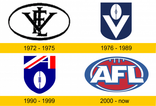
The first AFL logo lasted only three years. It was quite simple and nondescript. It consisted of only two elements: a black frame in the form of an oval medallion, vaguely resembling the outline of a Sherrin ball, and a monogram with three overlapping black letters in the center of the logo on a white background.
The frame had a wide outline that tapered at the edges. The letters were of different sizes, this ensured the ease of perception of the monogram (L – elongated in height, V – in width). The firm and austere font style emphasized the masculinity and toughness of this sporting discipline.
1976 – 1989
Soon, the logo design was completely redesigned. The frame was changed to a dark blue rectangular heraldic shield with a round base. This shield color has been chosen to contrast best with the white elements of the logo. There were only two of them: a large V (Victorian), which occupies most of the backboard and a soccer ball, divided into two halves, with a lacing in the middle. Thus, the logo retained its minimalist look, while becoming more stylish and neat.
1990 – 1999
Since the rebranding and renaming of the league into AFL, the logo has been painted in the colors of the national flag of Australia. The shape of the shield was changed to a triangular shape with a narrowing at the head. The ball was left unchanged and moved to the bottom of the backboard. A red and white letter A (Australian) styled as an element of the national flag was added to the upper right corner.
The rebranding was intended to increase brand awareness in the international arena. By adding features of national symbols to the logo, the sports association emphasized the nationality of this unique sports discipline.
2000 – today
Before the start of the 21st century, the sports association decided to modernize its brand and completely changed the AFL logo. As before, only the colors of national symbols were used. However, the logo has a completely new shape.
It was more complicated and consisted of more elements. The broad oval shape in blue symbolized the Australian football field. Inside the blue was a red oval with a white outline, but smaller (Sherren’s ball). And in the center of the logo there is a voluminous white inscription with a blue outline (the name of the league). The notches on the outer letters look like small wings, which indicates the high dynamics of the game.
Color and font
The logo font has been on the path of minimalism for a long time. And only after 1990 it received its unique distinctive features. They consisted in the use of colors and forms of national attributes on all elements of the logo, including the inscriptions.
The fact that it is a national sport played a huge role in the formation of the AFL logo. And the Sports Association of Australia has consistently emphasized this feature.


