Arkansas Razorbacks is an athletic branch of the University of Arkansas, in USA. There are many teams in the organization, although the most influential and cherished are their football and basketball ones. Curiously, they have more teams for women than they have for men.
Who owns Arkansas Razorbacks? The team operates under the University of Arkansas. They are the sole owner of the organization.
History Logo
The current name was adopted in 1910, although the organization itself predates this change. The football team, for instance, plays since the 1890s. There are many wild pigs in Arkansas, and the players of their football team were frequently compared to them in persistence and pressure, which were the reasons for the name to be chosen.
1931 – 1938
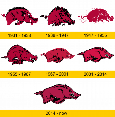
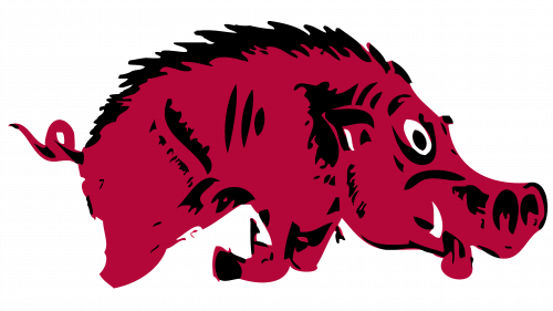
Initially, the logo was the crude drawing of a wild hog, with the burgundy-colored body, some black details (including the hair), white tusks and widely open eyes. The drawing was stylish in a way, but not particularly distinct.
1938 – 1947
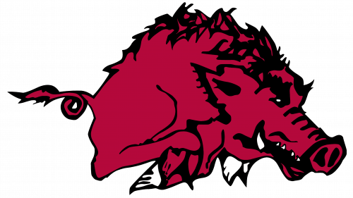
In 1938, they updated the logo, mostly by giving the beast a wilder, more believable expression and more pronounced features, including the hairs. The rest was pretty much unchanged.
1947 – 1955
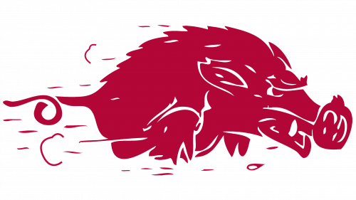
The style and general look persisted, although they made the pig more compact and emphasized that it’s rushing at great speed. The black parts were supplanted by white in this edition.
1955 – 1967
The 1955 variation was heavily redrawn, including the softer, more moderate use of the color black and a more realistic texture of hair. The same can be said about most features. Notably, they removed almost all white from the emblem and even made the eyes as tiny as possible, giving the pig a rather daft look in the process.
1967 – 2001
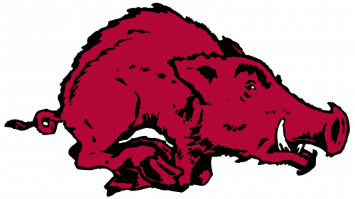
They used more or less the same approach for this emblem, although they again elected to make the features and the pig in general more compact. This means all the details were softer and smaller. The head in this new design is by far the most effort they’ve spent until this point, and the expression on it is more determined this time.
2001 – 2014
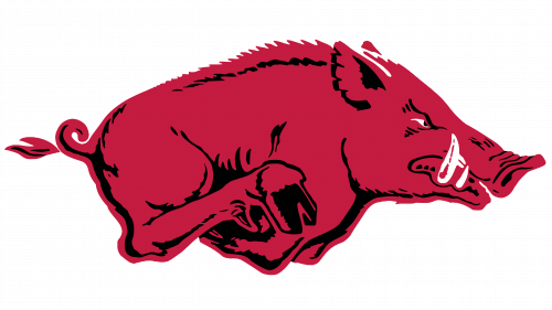
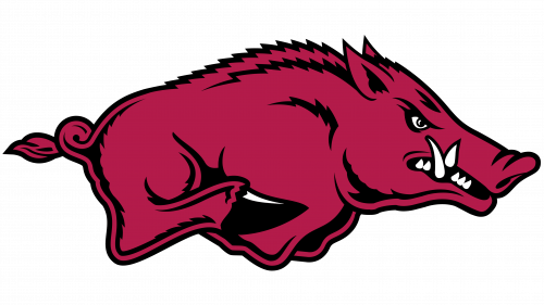
Although the 1967 logo was more pleasing and soft, it was still rather hazy on the details. In 2001, they added more fidelity to the logo and properly highlighted all the nuances, features and elements. In short, it’s a lot more distinct and pronounced, although also dominated by lines this time.
2014 – today
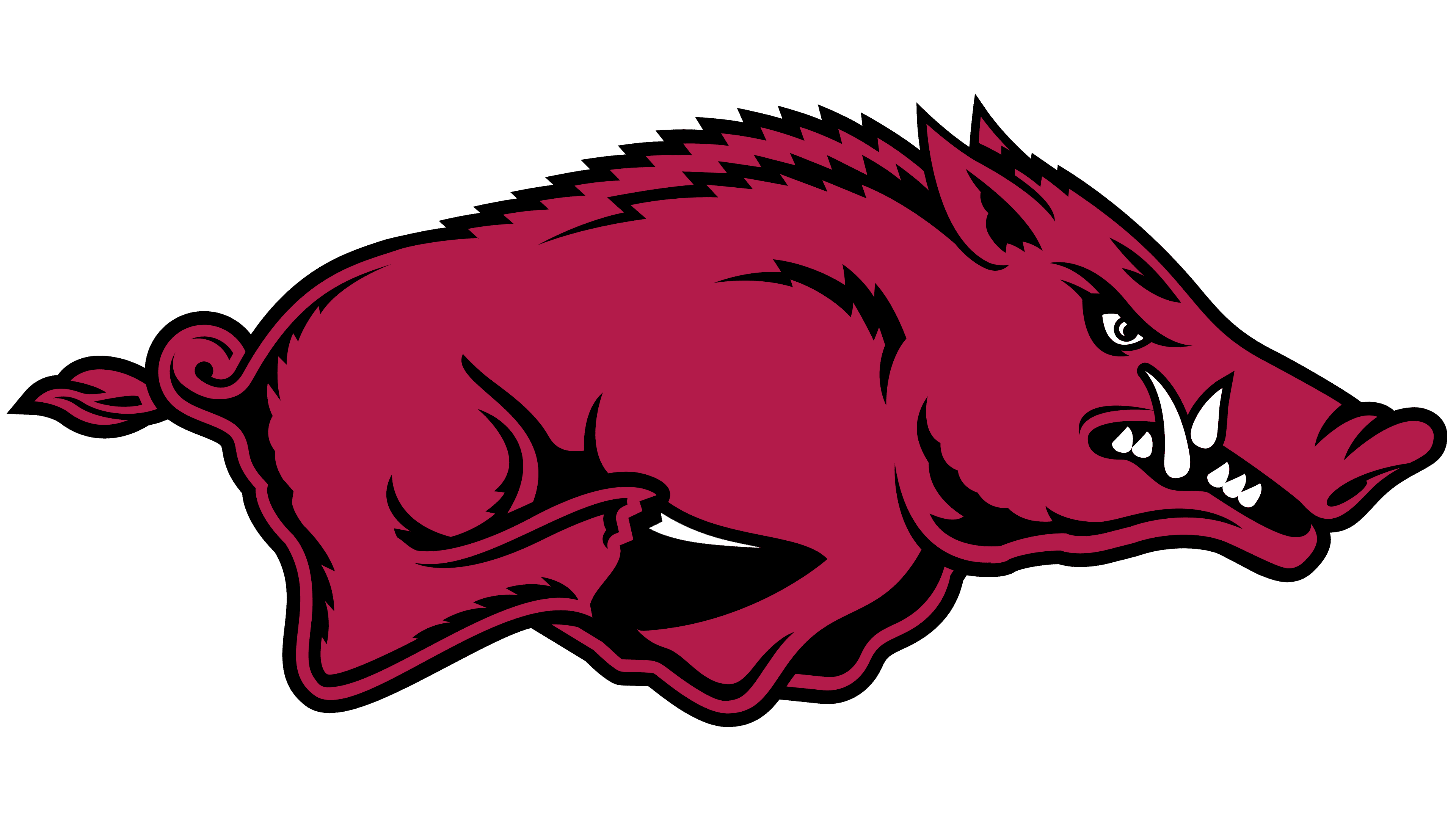
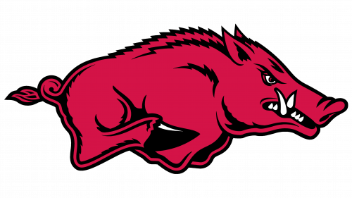
In 2014, they changed little, except make the red darker, turning it into a proper burgundy again.
Helmet History
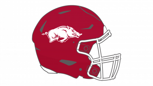
The football Razorbacks have a long list of historic helmets, although they generally varied little from phase to phase. Initially, they were white with some burgundy additions here and there. Later, these two were switched for several decades, and it wasn’t until recently that white designs started appearing again, mostly for away.
Uniform History
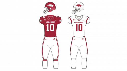
The football uniforms of the Razorbacks were essentially very similar to the helmets in terms of coloring. They were either white with some red details or vice versa. At the same time, the pants could be white or burgundy, although they never paired burgundy jerseys with the pants of the same color.
Arkansas Razorbacks Colors
CARDINAL RED
PANTONE: PMS 201
HEX: #9D2235;
CMYK: (7, 100, 68, 32)
RGB: (157, 34, 53)
WHITE
HEX COLOR: #FFFFFF;
RGB: (255, 255, 255)
CMYK: (0, 0, 0, 0)

