Boston Bruins is an American hockey team from Boston. They are very old and rather effective. It’s the oldest ice hockey team in America to compete in NHL, and they usually occupy high places in the Eastern division of the League. In total, the team won 6 Stanley Cups over the course of their life.
Who owns Boston Bruins? Jeremy Jacobs owns the Bruins. He’s also a CEO of Delaware North, a versatile entertainment and food conglomerate.
History Logo
![]()
The club was established in 1924 in Boston. The word ‘bruin’ is an old English name for a brown bear. When the founders discovered it, they decided it fits their new team very well: it also starts with ‘B’, matches their aggressive nature and complements their already acquired brown uniforms.
1924 – 1926
![]()
The original logo was a big T-shaped plaque colored brown and with additional yellow elements. The top edge was adorned with the word ‘Boston’ in big blocky letters, while the bottom accommodated ‘Bruins’ in thin brown characters. Between the two, there was a small picture of a brown bear.
1926 – 1932
![]()
The brown background was removed from the logo, and some elements were altered. For instance, ‘Brown’ received a more homogenous style and size, while the colors around ‘Bruins’ were reversed. The bear stayed, however.
1932 – 1934
![]()
In 1932, they adopted a big capital ‘B’ styled with the athletic serif many teams used back then (and still do). This image is beloved by many Bostonian clubs, but this one is brown and outlined with yellow.
1934 – 1949
![]()
Several years later, they reshuffled their usual color scheme, replacing the brown on the logo with black.
1949 – 1995
![]()
In this logo, the letter was used exactly as it appears on the previous logo, except without the two ends protruding from the left side. It was them put on a steering wheel of sorts – black with yellow bars. It probably signifies the city’s past as the biggest port on the Coast.
1995 – 2007
![]()
In 1995, they made the color scheme brighter and more saturated, compared to the previous pale logotype.
2007 – today
![]()
This time, they added outlines to everything: black to the letter and the stripes, and yellow to the outer circle.
Helmet History
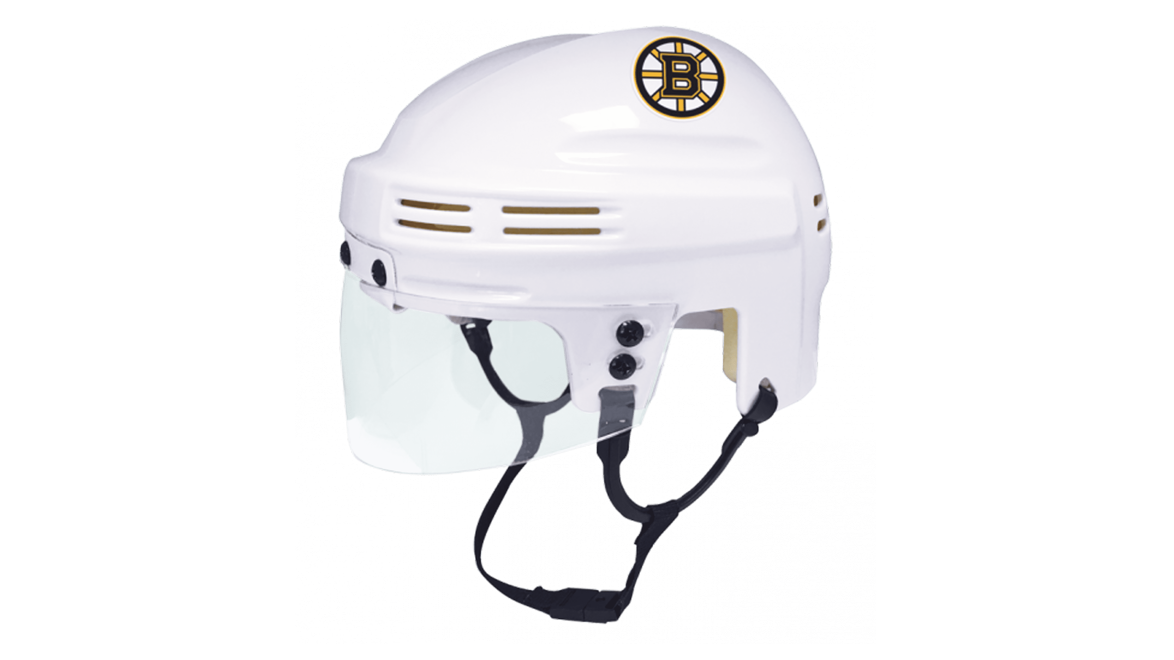
The Bruins helmets are primarily black, and were black since the 40s. Sometimes, they would add yellow stripes or other details to it, but they mostly prefer pure black. Before then, the helmets were different shades of brown. And throughout the history, there were also plenty of white variations for away matches.
Uniform History
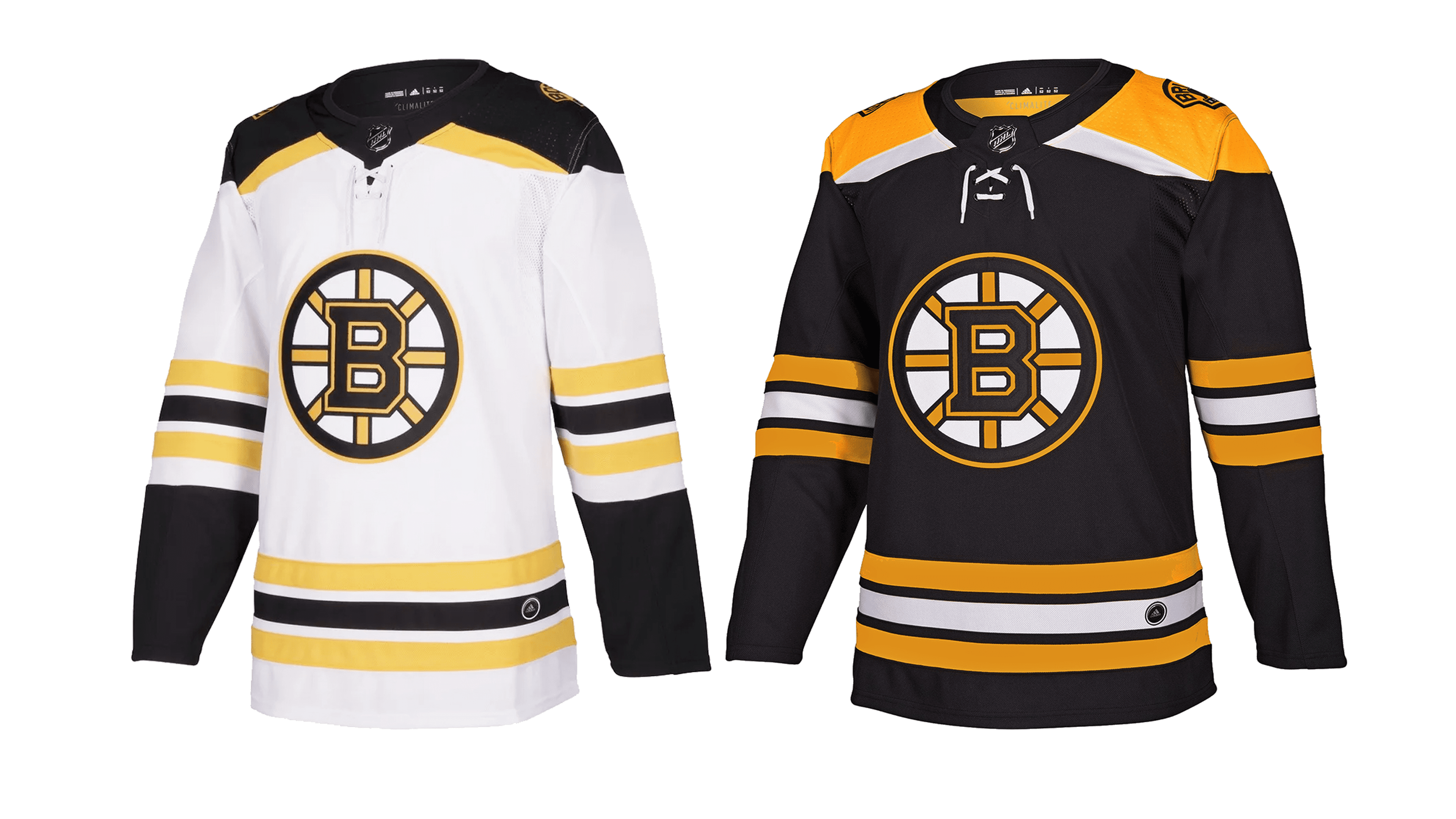
The ancient uniforms were brown, matching the name. However, after the team decided that color black suits them better, they started using this color more often. As a result, the jerseys were primarily white, black or yellow (with preference for black), and the other two colors posed as complementing.
Boston Bruins Colors
GOLD
PANTONE: PMS 1235 C
HEX COLOR: #FFB81C;
RGB: (252, 181, 20)
CMYK: (0, 31, 98, 0)
BLACK
PANTONE: PMS BLACK 6 C
HEX COLOR: #000000;
RGB: (17, 17, 17)
CMYK: (0, 0, 0, 100)