Chelsea is one of the most productive football clubs in England. It’s one of the oldest teams in the country, and over the course of their history they’ve accumulated more trophies than most of their counterparts, being only outpaced by Manchester United, Arsenal and Liverpool.
Who owns Chelsea? Chelsea is owned by Roman Abramovich. He’s a Russian-Jewish magnate living in Britain.
History Logo
![]()
The team was formed in 1905 in the Fulham borough, London. Because Fulham already had a dedicated team, it was instead decided to name the new club after the neighboring Chelsea. As such, Chelsea is one of the younger traditional clubs, with most of their rivals being formed in the late 19th century.
1905 – 1952
![]()
The original logo depicted an elderly soldier clad in brown uniform with several medals. He was depicted in a colorful color against the circular white background. Around, they outlined the image with a blue ring that was stylized as a belt with several holes, a fastener and brown rims.
In it, they also wrote the full name – ‘Chelsea Football Club’ – in capital brown letters.
1952 – 1953
![]()
For a few years after that, they had a logo that was somewhat inspired by Real Madrid – a blue shield with several letters piled one over the other inside. These letters were taken from the full name and arranged in various sizes in the same section.
There were two ‘C’s (for ‘Chelsea’ and ‘Club’) that were rather disproportionally squat and looked like horseshoes – one inside the other. Piercing them was a tall ‘F’ written in a thin Gothic style. It stretched all the way from the shield’s top to its bottom.
1953 – 1964
![]()
In 1953, they decided to use a Chelsea rampant lion as a centerpiece of the new logo. It was a blue upright lion holding a yellow staff in its paws. Around was a blue ring with golden rims, as well as the golden letters that made up the team’s full name in the lower half of the figure.
Above, they added instead several red flower shapes.
1964 – 1967
![]()
The 1964 design was rather simple in comparison: a single blue square with free capital letters arranged diagonally. They were written in an elegant cursive, colored white.
1967 – 1986
![]()
They mostly just reused the lion from the 1953 design, except made the animal simpler in detail and added a lot of white lines for prominence. The yellow staff it held was now red to match the tongue. The only other detail is a trio of blue capital letters right below the emblem proper.
1986 – 1995
![]()
In 1986, a new design followed. It was a circle with the three club letters arranged in an angular position closer to the bottom of the shape. In the opening inside the ‘angle’, they put a rather realistic drawing of a lion perching on the letters.
The colors went, as follows: dark blue for the circle, white for the letters and red for the lion.
1995 – 1997
![]()
In 1995, they removed the circle and repainted the other two details: the letters turned a bright turquoise, and the lion was a mix of turquoise and yellow (for the parts that were blank before).
1997 – 1999
![]()
Two years later, they reintroduced the circle, but made it close to the dark purple rather than blue. Parts of the lion that were turquoise prior became yellow, while the letters returned to just white.
1999 – 2003
![]()
In 1999, they got rid of the circle again and painted everything the same shade of pale blue.
2003 – 2005
![]()
All the colored parts from the previous design were this time white, while the circle came back again, this time brightly blue.
2005 – 2006
![]()
For their 100-year anniversary, the team decided to return to the old traditional lion depiction. They took the animal along with the staff, and colored both completely blue (except for minor white inlets). Compared to the ring around (which also made the resurgence), it was much smaller.
The ring was still blue, but outlined with pale gold. The contents changed more. The club name was split up: ‘Chelsea’ was now on top, and the rest in the bottom, both parts colored white. Separating them on both sides were the flowery shapes just like from the original lion logo, but set in the same pale gold and placed inside the small white circles.
The final touch was two golden inscriptions above and below, beset by the two strokes of gold on each side, for each inscription. The one above said ‘100 years’, and below was the word ‘centenary’.
2006 – today
![]()
In 2006, they removed the anniversary parts and added some red: notably, for the flowers on each side, and for the tongue that was previous blue.
Uniform History
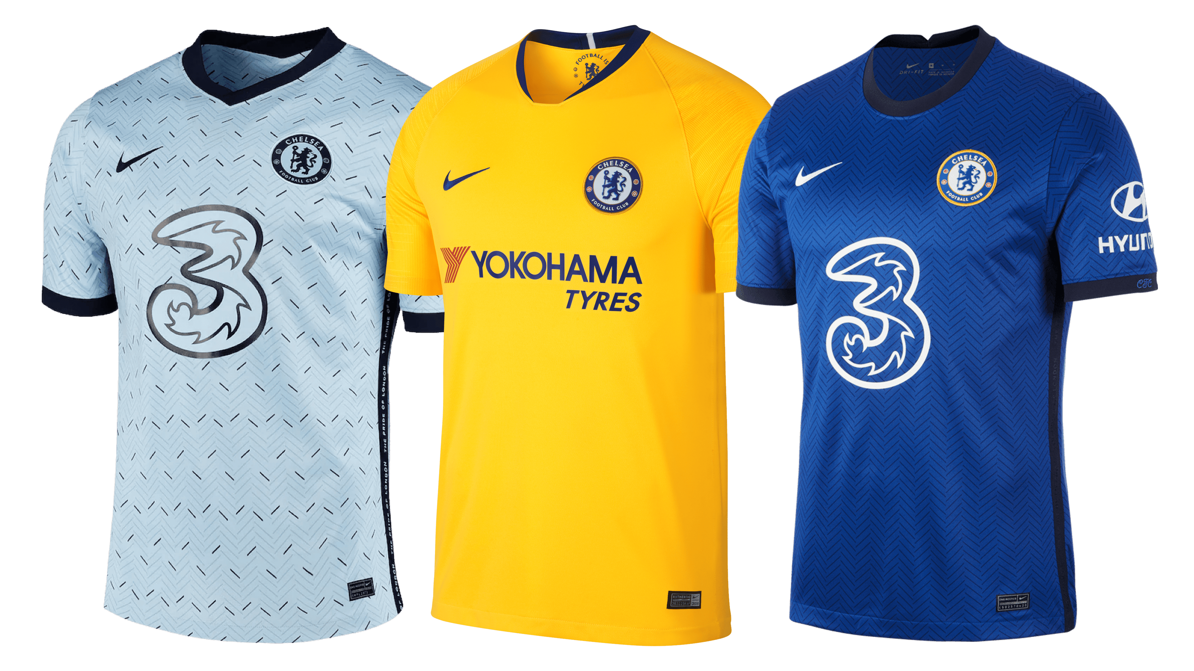
Traditional for old English teams, the home colors of Chelsea barely changed over the century. The uniforms were always completely blue, save for the white socks. The away colors, also traditionally, changed all the time. The earlier colors were mostly blue, but then they started spicing up with red, white and, most often, yellow.
Chelsea Colors
BLUE
PANTONE: PMS 7687 C
HEX COLOR: #034694;
RGB: (3, 70, 148)
CMYK: (100, 83, 10, 1)
RED
PANTONE: PMS 1788 C
HEX COLOR: #EE242C;
RGB: (238, 36, 44)
CMYK: (0, 98, 91, 0)
GOLD
PANTONE: PMS 7555 C
HEX COLOR: #DBA111;
RGB: (219, 161, 17)
CMYK: (15, 37, 100, 1)
LIGHT BLUE
PANTONE: PMS 2115 C
HEX COLOR: #6A7AB5;
RGB: (106, 122, 181)
CMYK: (64, 51, 4, 0)
GRAY
PANTONE: PMS 427 C
HEX COLOR: #D1D3D4;
RGB: (209, 211, 212)
CMYK: (17, 12, 12, 0)