Chicago Bears are an American football team from Illinois. They are considered one of the older clubs, being active since the 20s. They were actually one of the founding teams of NFL, even though now they are counted among the moderately-powerful teams (closer to the bottom of the list, ranking-wise).
Who owns Chicago Bears? He club is owned by Virginia McCaskey. He’s a rich entrepreneur whose net worth is estimate at well over a billion dollars.
History Logo
![]()
The team was created in 1920 and was originally known as Staley’s Decatur. The reasoning is that they were established in the Illinoisan city of Decatur by the food magnate Augustus Staley. That would not do, and the next year they were renamed ‘Decatur Bears’, and the year after – ‘Chicago Bears’ (following the move to Chicago).
1920 – 1921
![]()
The first logo was a bicolor circle of orange (upper half) and purple (lower half). Furthermore, there were several writings inside the circle: namely, the big purple letter ‘S’ in the orange space and the full team name written in white below. While everything else was written in the usual college style, the ‘Decatur’ was an elegant cursive font.
1921 – 1940
![]()
The new logo was primarily a big orange & purple word ‘Staleys’, written in the ordinary ‘athletic’ college style. Right above, they also fitted a depiction of a brown football with white writing inside. It said: ‘American Professional’ along the top edge, ‘1920’ in the middle & ‘Football Association’ in the bottom.
1940 – 1945
![]()
The 1940 logo was instead a rather realistic depiction of a black bear cub running on its rear paws with an orange football in its right ‘hand’. They visibly put a lot of effort into this illustration, including shading, illumination and more. That’s likely why it was scrapped so soon.
1946 – 1973
![]()
They used both the bear and the ball again, except this time both were simpler and less nuanced. The ball was much bigger, although still orange, with the white seams and black outlines. The bear, for its part, was depicted climbing the top of the ball, and it was now colored dark blue (after the team colors).
1962 – 1973
![]()
In the 60s, the team introduced an even simpler, secondary logo that was simply a wide letter ‘C’ stretched into a shape of a ball (without the right-most section, however). It was almost completely white, with the exception of a blue outline.
1973 – today
![]()
In 1973, they scrapped both in favor of a new design: almost exactly the same as the 1962 variant, except with a massive orange inlay inside the ‘letter’. There was still plenty of white between the edges and this orange space, because these three were the team’s traditional colors.
Helmet History
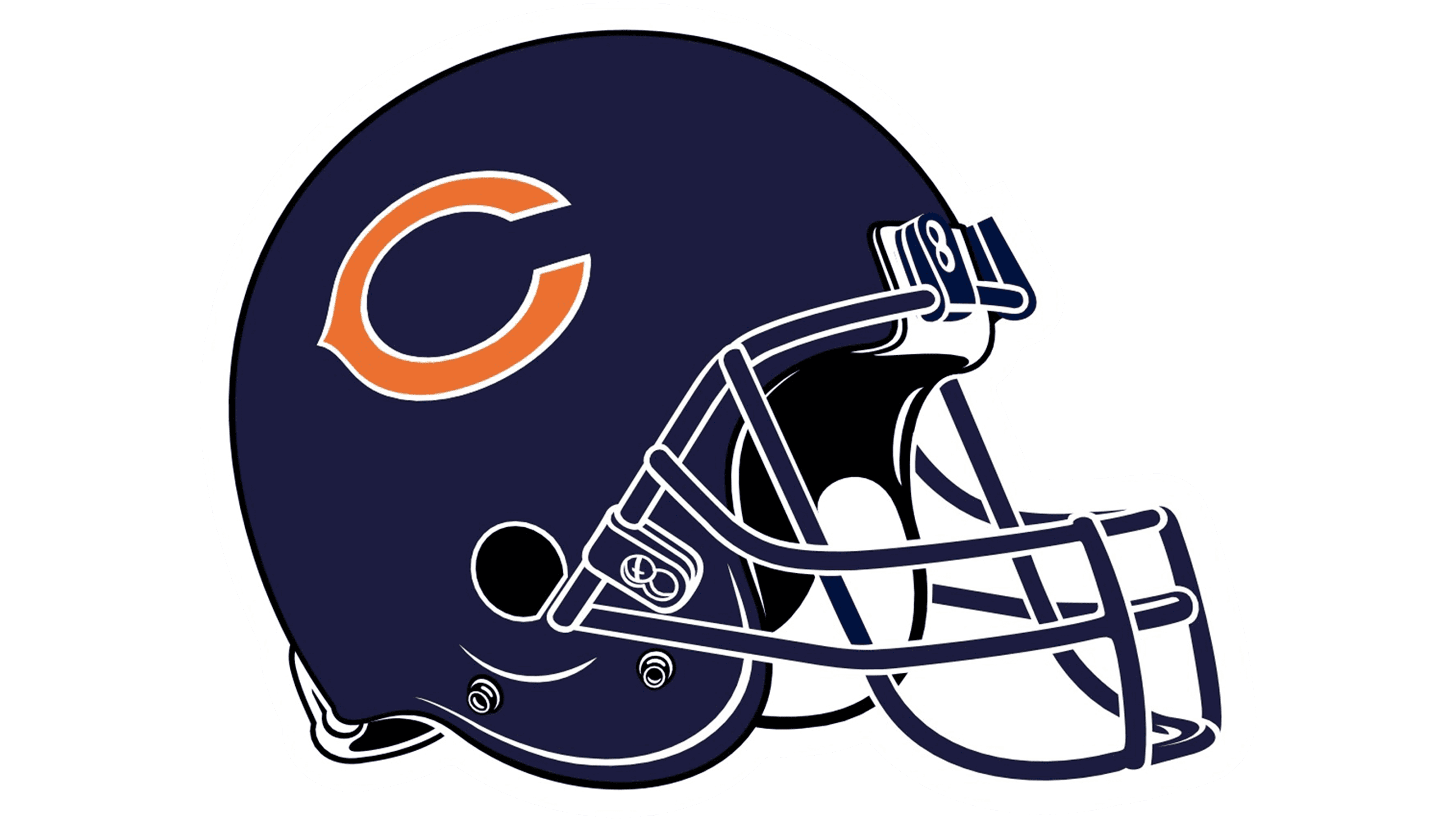
Since the even before the 60s, the design of their helmets features simply big dark blue hulls the logo of the time on the temples. From 1962 to 1973, it was a white ‘C’ emblem, and after that they added an orange inlay. But even before the 60s, their usual helmets were dark blue without any insignias.
Uniform History
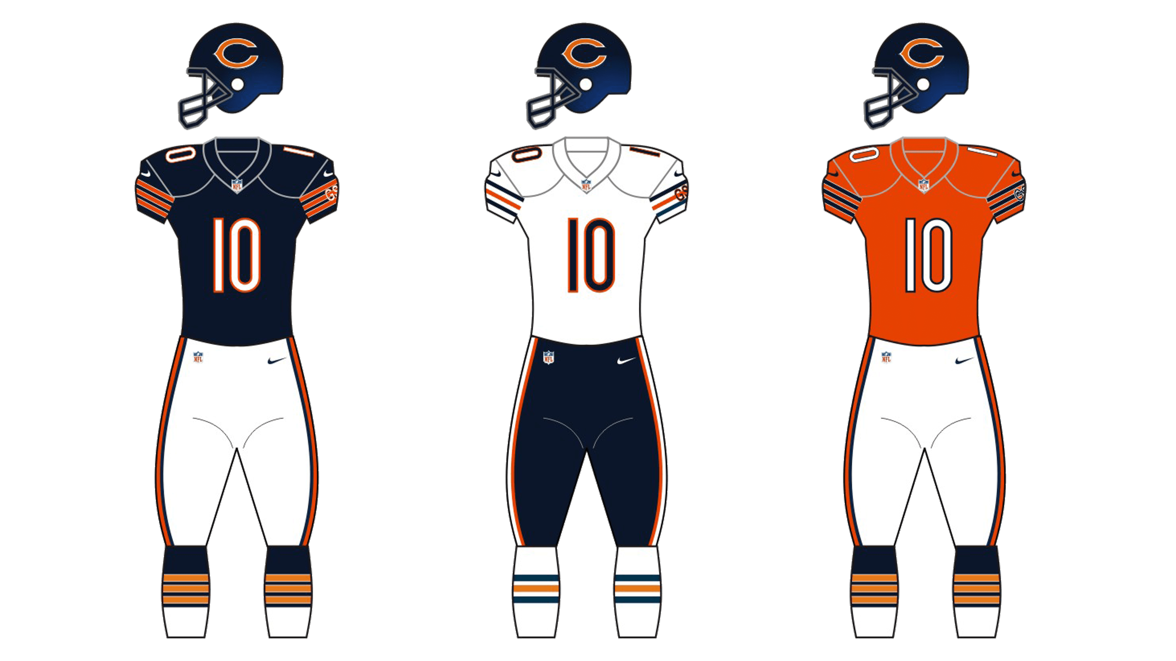
Since at least the 40s, the team’s uniforms included white bottoms and blue/orange tops (the orange ones were preseason, commonly). Later on, they scrapped the orange jumpers in favor of the reversed main uniforms (white tops, blue bottoms). It wasn’t the 21st century that they returned their old orange jumpers as alternative, out of nostalgia.
Chicago Bears Colors
DARK NAVY
PANTONE: PMS 5395 C
HEX COLOR: #0B162A
CMYK: (100, 60, 0, 80)
RGB: (11, 22, 42)
ORANGE
PANTONE: PMS 1665 C
HEX COLOR: #C83803;
CMYK: (0, 75, 100, 0)
RGB: (200, 56, 3)