Cleveland Indians is an American baseball team from Ohio. In the Central division of the American League, they are counted amongst the most successful clubs overall. The reason behind their name and branding is that Ohio was once a home to many prominent Native American tribes.
Who owns Cleveland Indians? Paul Dolan is a current owner of the team. His family owned the club for several generations.
History Logo
![]()
The team was created in 1894 in Cleveland, Ohio. As such, they are one of the older, although not the oldest, baseball teams in America. The name ‘Indians’ was used since 1915, although in 2021 they are changing it to ‘Guardians’ following a decades-long controversy about the usage of Native American symbols disrespectfully.
1901 – 1902
![]()
The initial logo was simply the word ‘Cleveland’ written in a usual ‘athletic’ font (which is basically a straightforward, angular style) with blue letters. It was rather ordinary, apart from being curved upwards.
1902 – 1903
![]()
This design was even simpler: a single ‘C’ written in the same style and color as the previous lettering.
1904 – 1905
![]()
In 1904, they repainted the previous design red and continued using it.
1905 – 1906
![]()
The 1905 logo was the same letter, except square in proportion, squatter and wider.
1906 – 1908
![]()
In 1905, they replaced the font with a thin, cursive style. It was now much more elegant and looked hand-written.
1908 – 1910
![]()
In 1908, they used mostly the same letter design, but a bit bolder and slightly simpler (the complicated twirl from above was shortened).
1910 – 1914
![]()
The next design represented the same letter in the same color, except more geometrical and straightforward. It was basically a tall octagon with part of the right side removed to create a ‘C’.
1914 – 1920
![]()
It was pretty much the 1905 emblem reused for a few seasons.
1920 – 1927
![]()
By 1920, the letter style changed to a more fluid, softer font. There were several pointy appendages sticking out of several parts of the letter, which made it look almost like a bone.
1927 – 1929
![]()
In 1927, they introduced the first version of their later-iconic Indian mascot. This one was a crude red shape styled to look like a head in profile and charted with jagged black lines. The black was also used for several feathers that stuck from the man’s hair in the back.
1929 – 1932
![]()
In 1929, they remodeled him into a more believable image: a bright red face with much more human features, in addition to a white feathered headwear with red tips.
1932 – 1938
![]()
Later on, they decided to give it a more realistic color palette. The face in this version was yellowish. Hair, that didn’t have its own color before, turned black and was adorned with a much smaller headwear. The feathers were this time yellow and had more red around the tips.
Other colors included white (in the base of the headdress) and a green scarf.
1938 – 1945
![]()
In 1938, they opted for an even more realistic depiction: a pink circle with the same premise as in the 1929 emblem, but not in profile, and also with realistic features, proportions and so forth.
1945 – 1947
![]()
Later, they opted for a more cartoonish approach. In 1945, they decided to draw a mascot: a white-clad baseball player with a very wide stance and a massive red head. It had exaggerated Indian features, including a toothy smile, a somewhat silly glance, completely red skin and a red feather stuck in the hair.
1947 – 1949
![]()
The next design is basically the same head (without the rest of the body), although here it’s turned right towards you and not sideways.
1949 – 1972
![]()
Again, it’s mostly the same head with minor changes (such as a longer feather and slightly different features), although it’s again turned to the side. At the same time, the eyes look in the opposite direction, creating a mischievous air about him.
1972 – 1978
![]()
In the 70s, they returned the head to its body, gave the man a bat and arranged him into a striking position. Notably, he was mostly colored white or blue, and red was only reserved for a feather and the arrow-like stripes along the socks. This man was then put right onto a big baseball image (white with blue outlines and red stitches).
Along its top and bottom edges, there were words from the club’s name: ‘Cleveland’ & ‘Indians’ respectively. The font was rather simple, soft and angular.
1978 – 1985
![]()
After that little experiment, they basically returned to the pre – 1972 logo, but mirrored it.
1985 – 2013
![]()
Here, they only changed coloring a bit, turning bright red into a shade of pink.
2013 – today
![]()
And this time, they basically just returned to the ancient letter ‘C’ from 1904. Back then, it was violent red, but this one matches the prevalent color from the previous design.
Helmet History
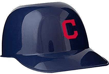
Their helmet designs varied a lot, although for much of the later 20th century they used black designs with red rims, in addition to the current emblem on the forehead area. This was their most preferred combination, but there were also completely blue and completely red designs.
Uniform History
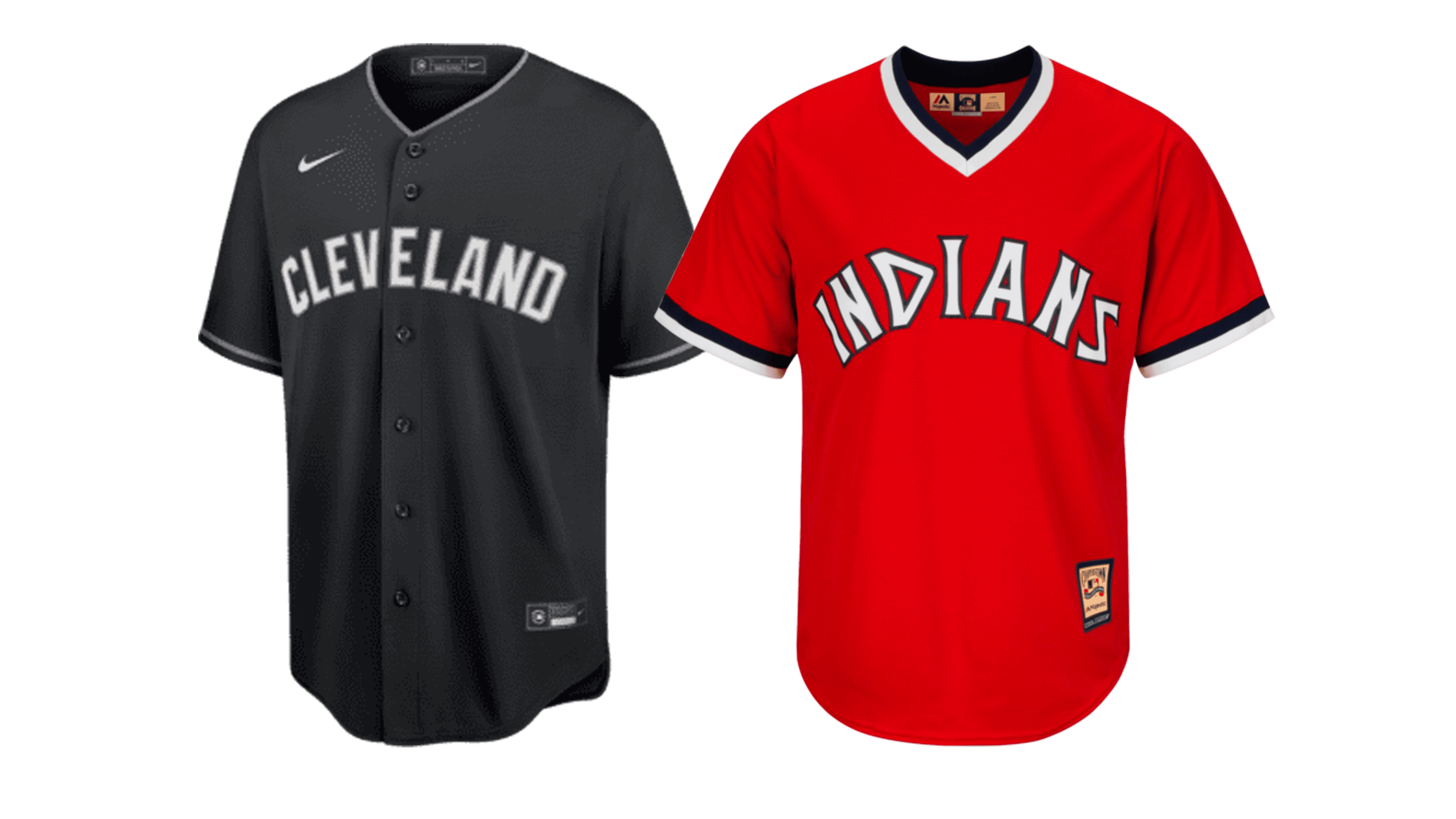
The preferred uniform pattern, for its part, was almost completely white or almost fully grey (for away uniforms). There were some that used, for instance, red, blue or grey sleeves, but these were just occasional. The details such as letters and numbers, however, were almost always red.
The red jerseys were always popular alternatives, and they have been by far the most memorable designs.
Cleveland Indians Colors
NAVY BLUE
PANTONE: PMS 289
HEX COLOR: #0C2340;
RGB: (12,35,64)
CMYK: (100,60,00,56)
RED
PANTONE: PMS 199
HEX COLOR: #E31937;
RGB: (227,25,55)
CMYK: (00,100,65,00)