Indianapolis Indians is a baseball team from Indiana, USA. They compete in Minor League Baseball on behalf of their city, which means they still play on the nation-wide level, but their skills aren’t yet recognized enough to be admitted into Major LB. That being said, inside their League they are considered one of the stronger clubs.
Who owns Indianapolis Indians? The team is managed by the Indians Inc. company. Their chief manager is Randy Lewandowski.
History Logo
![]()
The team is active since 1902. They were established in Indianapolis, capital of Indiana. In addition to the state’s being an ancestral land of many Native American tribes, the name choice was rather obvious. In 2020, however, they announced a name change to ‘Indianapolis Guardians’.
1969 – 1985
![]()
The 1969 logo was a clever combination of the usual Native American attributes and a baseball. They basically adorned an otherwise normal white ball with red stitches with the hairstyle usually associated with the Indians.
Basically, they divided the ball in to sections: upper and lower, divided with a white ribbon. Half of the lower part and the entire upper one were occupied by blue hair. The remaining baseball was supposed to be the ‘face’. Lastly, they also added a feather element, which was basically just the white map of Indiana with a red tip.
1985 – 1995
![]()
In 1985, they decided to instead use a grotesque picture of an Indian, depicted in white and black. They gave him a smug expression, gave him a ball and put the man into a throwing pose. There were many small nuances, but they were all exaggerated: big head, thin arms and legs and, of course, a stereotypical Indian hairstyle.
1995 – 1998
![]()
The 1995 logo is a traditional Native American star with four extremities and twin tips on each one. However, it’s more than just cultural homage. The upper-most extension is black, and the rest are adorned with a pattern of red, white, black and yellow. These were the colors of their uniforms for a long time: black caps and mostly red jerseys.
And they also put the club’s name in two parts above and below. They styled these as curved words – one black, one red. Both were written in an ‘athletic’ serif font.
1998 – today
![]()
In 1998, they mostly just made the red parts on the logo paler, including the lower word and much of the pattern. Not much else changed.
Helmet History
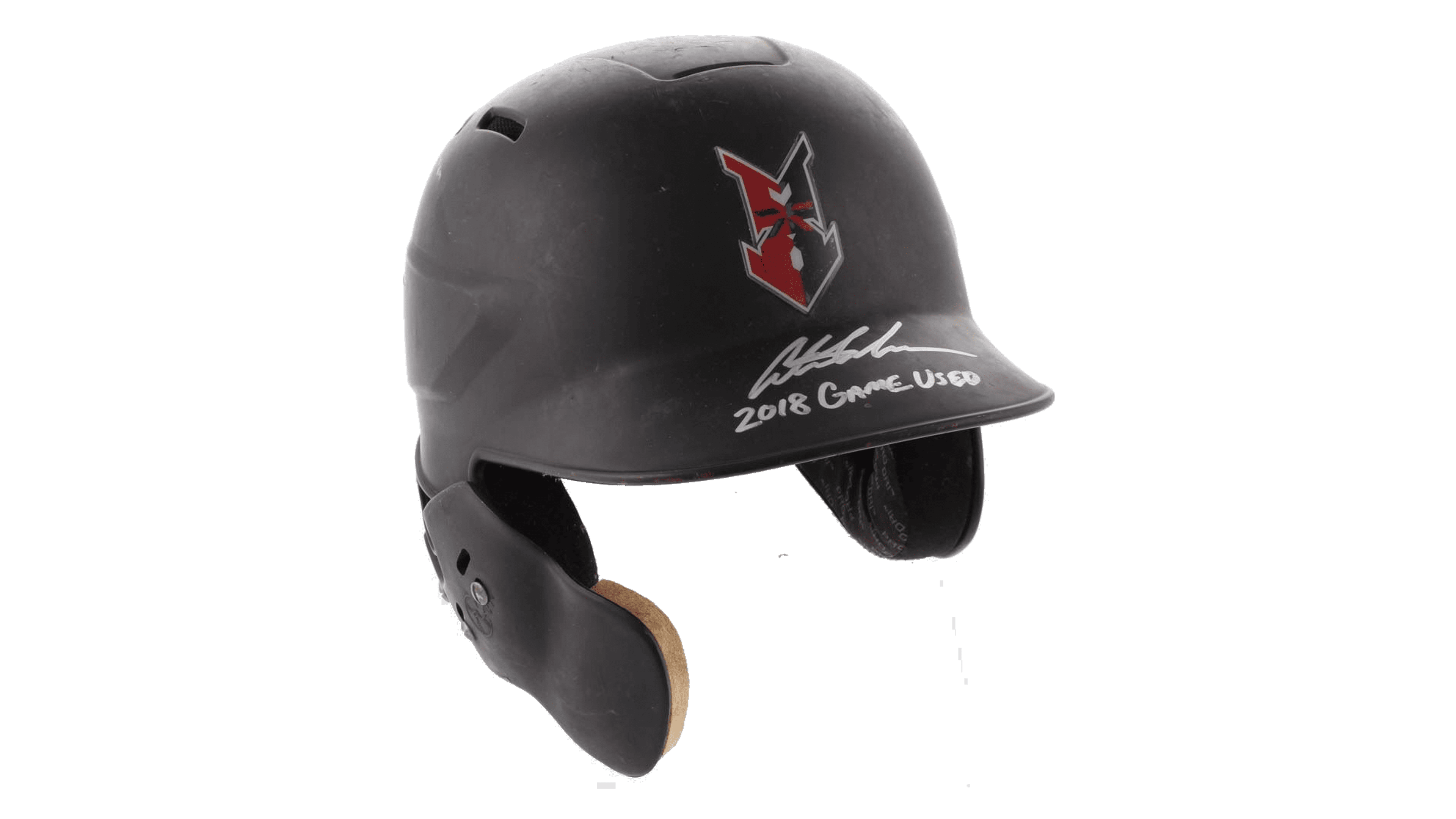
Most of their helmet and cap variations have been black, and blue before then. The only exceptions were the team emblems they used as decoration. And these weren’t the same they used for logotypes. The symbol since the 90s, for instance, is more of a black-and-red arrowhead.
Uniform History
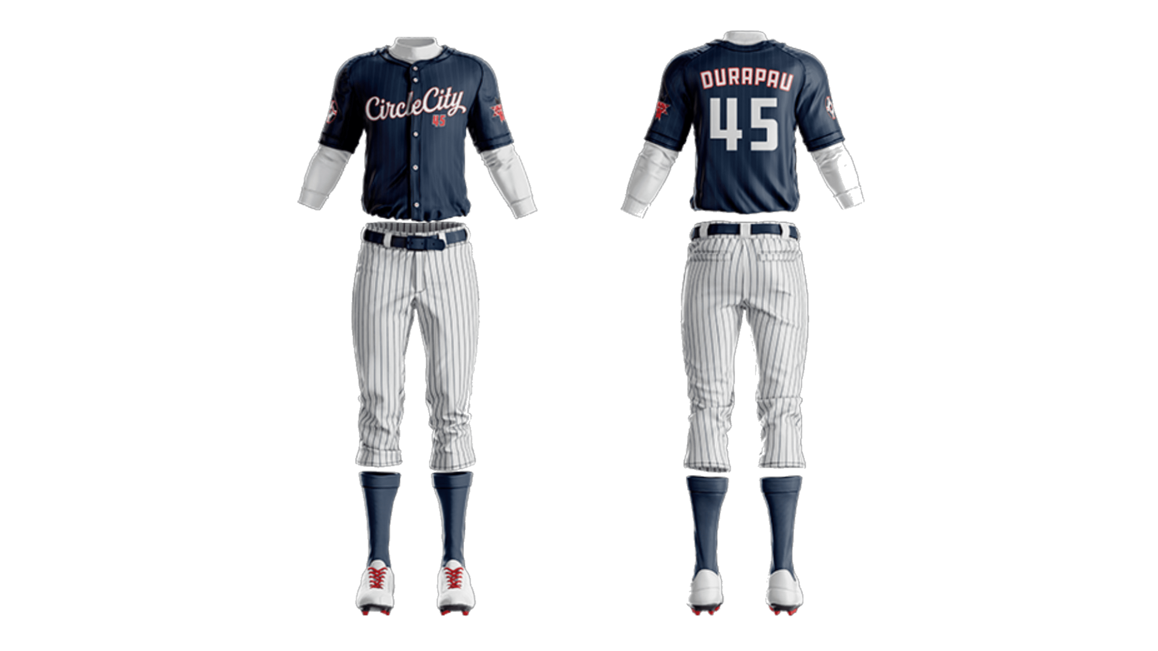
The older uniforms have been primarily white with blue (later red) inscriptions and numbers. Later, they adopted their iconic red shirts used in conjunction with black helmets. The white shirts are still used as alternative and away colors, alongside blue, to a lesser extent.