The Italian football league system is a round robin tournament of clubs. Serie A heraldry has undergone changes for almost a hundred years, reflecting the historical events and relationships between the countries participating in the competition. The command structure was different, but the competent tactics and defensive system of one of the best in the world of the football league remained.
Meaning and history
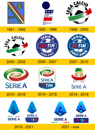
Major League Serie A was founded in 1898, when the competition was held in groups formed by regions. Since 1929, a new format began to operate, uniting teams of participants in a round-robin game. The logo of one of the most legendary football leagues in the world has undergone changes over more than sixty years of history.
1961 – 1992
The enduring Serie A logo was designed in 1961 as a rectangular badge in a gold outline. The symbol has existed for over thirty years, reflecting the history of the federation. The diagonal Italian flag divided the field in two. One featured a golden ball matching the FIGG monogram on the other side of the rectangle. The smaller inscription, “Lega Nationale”, was located in the lower left corner, was for informational purposes only. The vertically oriented rectangle has symbolized the best league in Serie A for many years, both graphically and informatively.
1992 – 1996
In 1992, the football league logo design changed. The golden glow and shine have given way to the blue – red – white filling of the emblem. The attention from the blue circle in the upper left corner shifted smoothly to three five-pointed stars against a blue background. The logo was notable for its informativeness, the inscriptions “Federazione Italiana Giuoco Calcio” and “Lega Professionisti Serie A” had the same font, confidently and professionally declaring leadership.
1996 – 2000
In 1996, the logo changed, the soccer ball in the frame of the Italian flag looked stylish and modern. The “Lega Calcio” lettering in an arc along the ball had the straight lines of a traditional script.
2000 – 2006
Laconicism, simplicity and elegance inherent in professionals – this is how you can characterize the new logo of the Series A, slightly modified in type and colors in 2000.
2006 – 2007
The 2006 season brought a new logo to the major league teams. A blue – white round badge with an inscription and date is diluted with a red emblem in the left corner. In the center, the traditional ball remains an unshakable attribute symbolizing the best game in the world.
2007 – 2010
The logo underwent minor changes in 2007-2010, with more purity of color, accuracy and a new date at the bottom of the picture.
2010 – 2016
The stylish horizontal oval of the field in a gold frame, combining the three colors of the national flag of Italy, represented the Serie A emblem in 2010. The blue lettering under the logo, in slightly flared font at the ends, carried the information about the name of the football league. A few months later, the icon was placed on a white background, leaving the three-dimensional image inside the picture.
2016 – 2018
The banner at the bottom was modified in 2016, combining the inscriptions of the previous versions.
2018 – 2019
The new color palette has made the overall visual effect in 2018 lighter and brighter. The orbital element around the letter A emphasizes the graceful structure of the emblem.
2019 – 2021
In 2019, the logo design introduced the letter A in geometric 3D with traditional blue hues. The diamond-shaped triangle is highlighted by the symbolic colors of the Italian flag.
2021 – today
In 2021, a new version of the emblem contrasts the shades of the lettering at the bottom of the different colors “SERIE A” and “TIM”.


