Juventus is perhaps the most famous football club from Italy. Simultaneously, it’s one of the oldest surviving such teams in this country. FIFA regularly ranks them as one of the 15 strongest teams worldwide. In Italy, they are regarded as the most accomplished clubs, having won in total more than 35 championships.
Who owns Juventus? Juventus currently belongs to the Agnelli family. It’s one of the richest families in Italy, their net worth is estimated at almost $15 billion.
History Logo
![]()
The club was established in 1897 by several schoolboys from Turin, in Northern Italy. The very name ‘Juventus’ points at this fact, as it translates from Latin as ‘youth’, while also being the name of the Roman goddess of the same concept. Juventus is known for wearing completely white and black gear almost since their inception.
1905 – 1921
![]()
The club’s original logo was completely black-and-white. It had an elegant, complicated frame as if from the mirror, inside of each there was a striped vertical pattern, as well as the coat of arms of Turin – a rearing horse inside the shield, with the crown upon it. Through the middle of the inner space went a white ribbon with the club name on it.
Above all of it was a longer, thinner ribbon with the club motto written on it in Latin. In English it means: ‘he who doesn’t play by the rules, doesn’t wear the crown’.
1921 – 1929
![]()
The oval inner space of the previous logo made into this variation as well, although without any of the surrounding elements. This time, they colored it in mostly black and white, with some yellow (for outlines, crown and horse, as well as letters) and blue (for the inner part of the coat of arms).
1929 – 1931
![]()
It was a similar design: they used the same oval again, but made it wider and monochrome like before. The coat of arms, however, was completely supplanted by the drawing of a rearing zebra instead. This played off the team’s tradition to only wear striped black-and-white uniforms, and their subsequent moniker, ‘the Zebras’.
1931 – 1977
![]()
By 1931, they mostly returned to the old colored style of their logo, although the coat of arms part became much bigger, the name stripe became blue (like on the Torinese symbol), and the name’s font became thinner and more hook-like.
1977 – 1982
![]()
The 1977 design was a new approach. It was simply a black rectangle with white space inside. In it, they placed a single black star in the top right corner, and the rest was occupied by the dash engraving of a zebra and the club name (‘Juventus F.C.’) in the very bottom, written in black letters.
1982 – 1989
![]()
Once more, they used the engraving from before, but this time getting rid of all the other imagery and moving the name to the space around the drawing. ‘Juventus’ was put above the animal and curved, while the ‘F.’ & ‘C.’ were placed on either side of it.
1989 – 2004
![]()
This design was actually a lot like their first oval emblem, but with alterations. Firstly, they put two golden stars above the emblem. Secondly, the colored the name ribbon white, and the letters black. Thirdly, the coat of arms became completely yellow, except for the horse and the outline.
2004 – 2017
![]()
The 2004 logo is a lot like its predecessor, but with much more volume and glint. They also changed some coloring. The name ribbon got rid of its edges and was only highlighted by a stroke of orange beneath it. The city’s symbol was now completely black, save for the horse, much smaller and put in the bottom of this ‘badge’.
And lastly, they supplanted the yellow outline around with a thick black frame.
2017 – 2020
![]()
In 2017, they introduced yet another design. It consists of the stylized letter ‘J’ and the club name above. The former in particular is rather clever – it is essentially a thick black ‘J’ with a white stripe going through its middle, which again plays off their love for black and white stripes.
The club name, for its part, was written in completely black letters right above the main part of the logo. The font was rather geometrical and visibly angular.
2020 – today
![]()
In 2020, they simply got rid of the name part and simply went with the stylized letter.
Uniform History
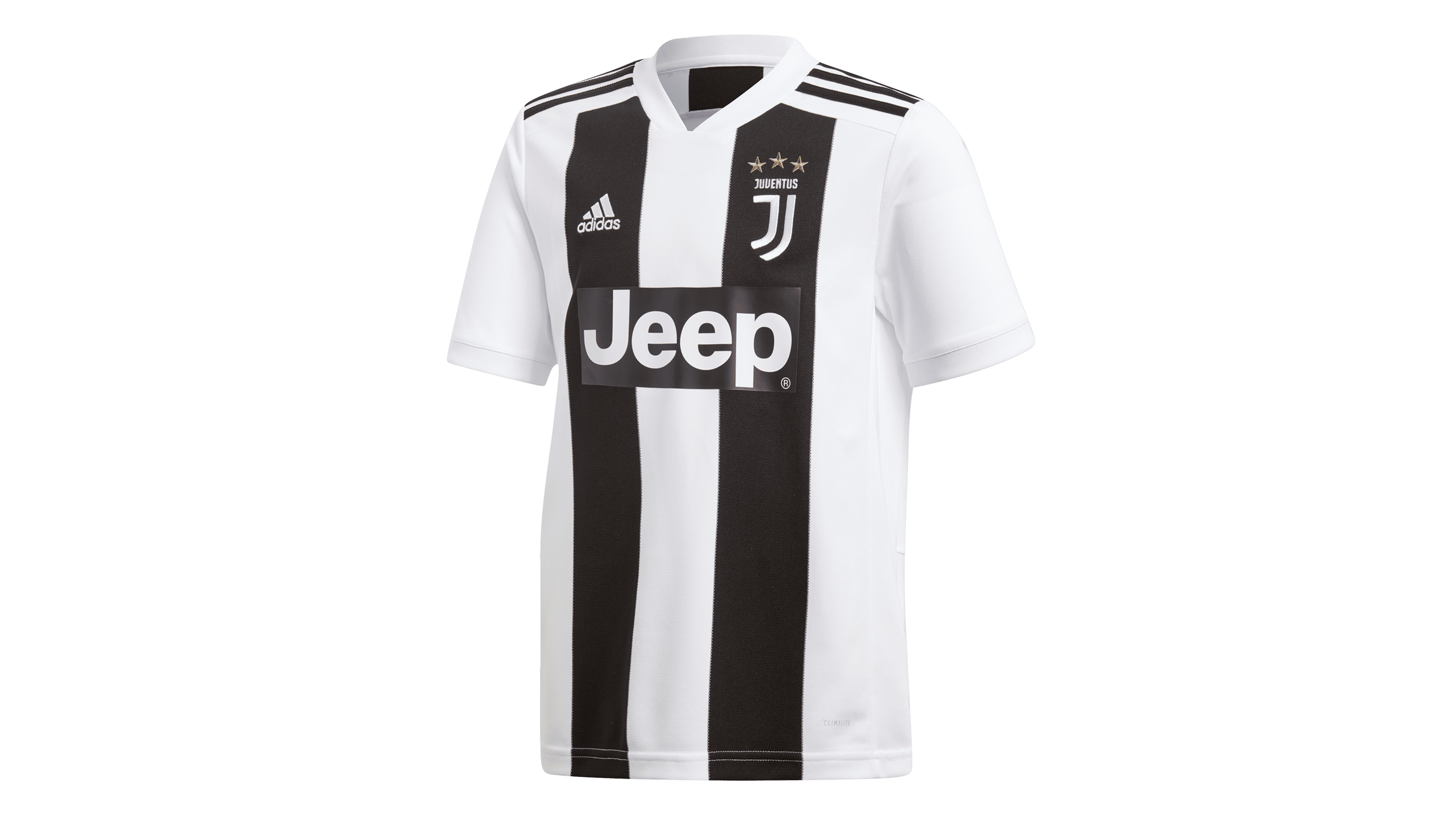
As mentioned, the team’s beloved design is a striped black-and-white pattern. They slightly changed it every couple of years throughout the history, but the general idea changed little (it only applies to the tops, however – the shorts were always white). The away colors differed much more, but the preferable choice was often just black or grey.
Juventus Colors
BLACK
PANTONE: BLACK C
HEX COLOR: #000000;
RGB: (0,0,0)
CMYK: (0,0,0,100)
WHITE
HEX COLOR: #FFFFFF;
RGB: (255,255,255)
CMYK: (0,0,0,0)