Las Vegas Raiders is an American football team from Nevada. They’ve been established in one of the NFL expansions in the 1960s. Raiders are hailed as one of the best teams in the West, as well as one of a continuous member of the League’s upper echelons, the top 10 teams.
History Logo
The team was established in 1960 in Oakland, California. Originally, the founders planned to call them ‘Senors’, but this idea quickly fell apart, and they eventually picked an intimidating, aggressive name that is ‘Raiders’. For some reason, their primary color has always been black, which is terrible for heat.
Who owns Las Vegas Raiders? The biggest stake of the Raiders belongs to Mark Davis. He holds onto it since 2011.
1960 – 1962
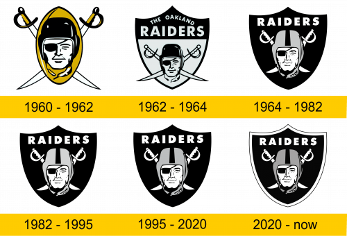
The original logo featured a golden vertical oval with pointed tips (obviously meant to look like a football). Behind it, there were two white sabers with golden-black hilts. However, the central piece was in the center of the oval detail. There was a head of a man with a black eye-patch over one eye and a black unbuttoned helmet.
1962 – 1964
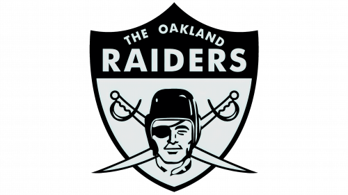
In 1962, they introduced the first in the line of their iconic shield logotypes. The same head was put this time onto the vast white space of a black-framed shield. The swords were also there, but turned into the more horizontal positions and without the golden parts this time.
The top of the shield was almost completely black, with the exception of the white writings: ‘The Oakland’ along the top and ‘Raiders’ bigger and a lower.
1964 – 1982
In 1964 they updated the shield. It was now completely black, except for the writings, of which only the word ‘Raiders’ stayed, and exactly where it was before. The head now occupied much of the central space. The sabers reduced in size and returned to their former positioning. This time they were almost completely white.
The helmet also changed. Before, it was black. Now, it’s grey with a single black stripe in the middle.
1982 – 1995
This logo was adopted when the team moved to Los Angeles. It’s almost exactly the same, with the exception of a marginally darker color palette.
1995 – 2020
This logo marks their move to Oakland again. The color palette darkened just a bit again.
2020 – today
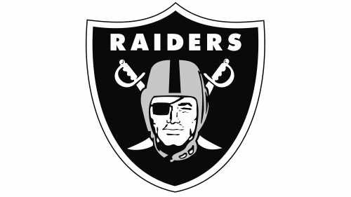
In 2020 they moved to Las Vegas. This time, they actually introduced something new: a thick white outline around the shield.
Helmet History
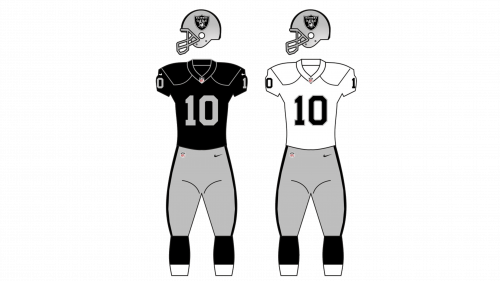
For much of their history, the team only had two proper helmet designs: a grey one with a black stripe along the middle, and the same thing but white. Some alternative designs also featured fully black helmets, but they aren’t really used because of the scorching heat of the Southern states.
Uniform History
Since the start of their history, the team mostly used black jerseys with white/grey pants. Occasional designs also used golden stripes across the sleeves – in particular, the very first uniform they used. Later on, they also started using white jerseys with the same pants, and they still do, as away variant.
Las Vegas Raiders Colors
RAIDERS BLACK
PANTONE: PMS BLACK 6 C
HEX COLOR: #000000;
RGB: (0, 0, 0)
CMYK: (0, 0, 0, 100)
RAIDERS SILVER
PANTONE: PMS 8180 C
HEX COLOR: #A5ACAF;
RGB: (165, 172, 175)
CMYK: (50, 38, 32, 2)

