Ligue 1 is the top football division in the French professional league system. Thanks to the sporting achievements of the teams at the international level, the French Football Association traditionally occupies high positions in the UEFA European Cup ranking. For example, in the Champions League final of the 19/20 season, the French club PSG lost the championship to Bayern Munich with a minimum score.
Meaning and history
Professional football in France began in 1932. Until 2002, the top football league was called Division 1. Then there was a rebranding, and the name was changed to “League 1”. Thus, the football association sought to modernize the brand and give it more of its own identity.
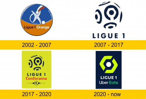
2002 – 2007
Together with the name, it was decided to update the logo of the major football league. The new title sponsor of the championship, the large telecommunications company Orange, had a huge impact on the appearance of the updated logo. The contract was signed for 5 years. The logo was rounded and painted in an orange-blue color to match the visual style of the title sponsor.
The abstractly depicted player with the ball in the center of the logo was intended to symbolize this sport. The colored stripes above his head are the colors of the national flag of France.
2007 – 2017
fter the expiration of the contract with Orange, Ligue 1 will remain without a title sponsor for a long time. The Football Association decides to customize the league logo. It takes on a rectangular shape and a light background, which gives the image a more modern look. The centerpiece is now the famous Ligue 1 trophy, the Hexagoal. Below it, the name of the league is indicated in large print, and even below is the symbol of Football League 1 (a football player with a ball).
2017 – 2020
In 2017, Liga 1 concludes a title sponsorship agreement for 3 years with a large retail chain selling furniture “Conforama”. The league logo has been slightly updated. All the previous elements on the logo remain. The light background was changed to yellow and a red inscription with the sponsor’s name was added. All new colors were consistent with the “Conforama” style.
2020 – today
With the arrival of a new title sponsor, Uber Eats, the League 1 logo has been updated and the Hexagoal logo is now simplified. Updated the color palette to match the style of the new sponsor. And they decided to remove the symbol of Football League 1, which has been at the bottom since 2007. The font has changed a bit. The overall style of the logo is pretty minimalistic.
Color and font
Title sponsorship contracts dominate in the choice of colors and font positioning for the logo. It is in them that the requirements for the logo style are usually prescribed. Since for the sponsor, this is an important element of advertising to promote their brand.

