Los Angeles Angels (formerly known as Los Angeles Angels of Anaheim) is a baseball team from California. There have been several baseball teams in this city prior to that, and the most prominent of them even wore the same name, but the current Angles were introduced in the 60s as part of the expansion program.
Who owns Los Angeles Angels? The team belongs to the businessman Arturo Moreno. He bought it from Disney in 2003, which in turn owned the team since 1996.
History Logo
![]()
The team was established in 1961 as Los Angeles Angels. A few years later they moved to Anaheim, although they kept the ‘Angels’ in the name, despite the fact that it was derived from their original city’s name. The current name – Los Angeles Angels – was adopted in 2015 after 10 years of them featuring Anaheim out of legal obligations.
1961 – 1965
![]()
During their initial ‘LA Angles’ phase, they used this logo: a light blue rhomb with a white frame and angelic imagery in the middle. The central piece was the ordinary baseball, featuring the letters ‘LA’ written in a peculiar, bone-like style, colored red. On each side, there was a white angelic wing, and above they fixed a halo.
1965 – 1971
![]()
A few years later, they were renamed to ‘California Angels’ and slightly changed the logo. The lettering changed to ‘CA’, although the style stayed as before. The halo shrunk in size and turned white, while the background blue became darker and brighter.
1971 – 1973
![]()
The 1971 logo depicted a white black-outlined map of California with the word ‘Angles’ written in red across it. Of note, it was completely lowercase. Less of note, there’s also a thin yellow halo on the left top corner of the silhouette.
1973 – 1986
![]()
In 1973, they made the first letter uppercase, giving it a pointed, tall look. Other than that, nothing changed.
1986 – 1993
![]()
In 1986, they reused the tall ‘A’ letter from before, while also giving it a halo of its own near the tip. This time, however, they placed it onto a shrunken, dark blue silhouette of California, which is in turn put in the middle of a normal baseball with dense red stitches.
1993 – 1995
![]()
By 1993, they were still California Angels. As such, this time they used the red ‘CA’ letters just like before, but in a more mundane, serif font. They somewhat outlined these in white and put them in the middle of a dark blue circle. It was for a long time their primary color.
1995 – 1997
![]()
In 1995, they decided to adopt the letters combination almost exactly as it was seen on the previous logo (except they received a slim dark blue outline now), and that only.
1997 – 2002
![]()
It was at this point that they moved to Anaheim, changing the name to ‘Anaheim Angels’. The logo also changed significantly: the team’s moniker was written in a soft, sharp font – the letters colored red and outlined in white & blue. The left side was joined by a single angelic wing.
This entire image was put right in front of a light blue shield, highlighted in white with ‘Anaheim’ and with a couple of baseball bats crossed behind it.
2002 – 2005
![]()
In 2002, they decided to reuse the old ‘haloed A’ symbol. Except this time they gave it a new style just like on the 1993 – 1997 designs, painted the halo silver and put the letter in front of dark blue fan-like shape with silver and red outlines. The only other addition was the words ‘Anaheim Angels’ written in black along the edges of the fan.
2005 – 2016
![]()
In 2005, the team moved back to Los Angeles and simplified their logo a lot. Primarily, they limited all the outlines to only dark blue and got rid of everything except the big letter and its halo.
2016 – today
![]()
In 2016 a small change followed after which the red became visible darker.
Helmet History
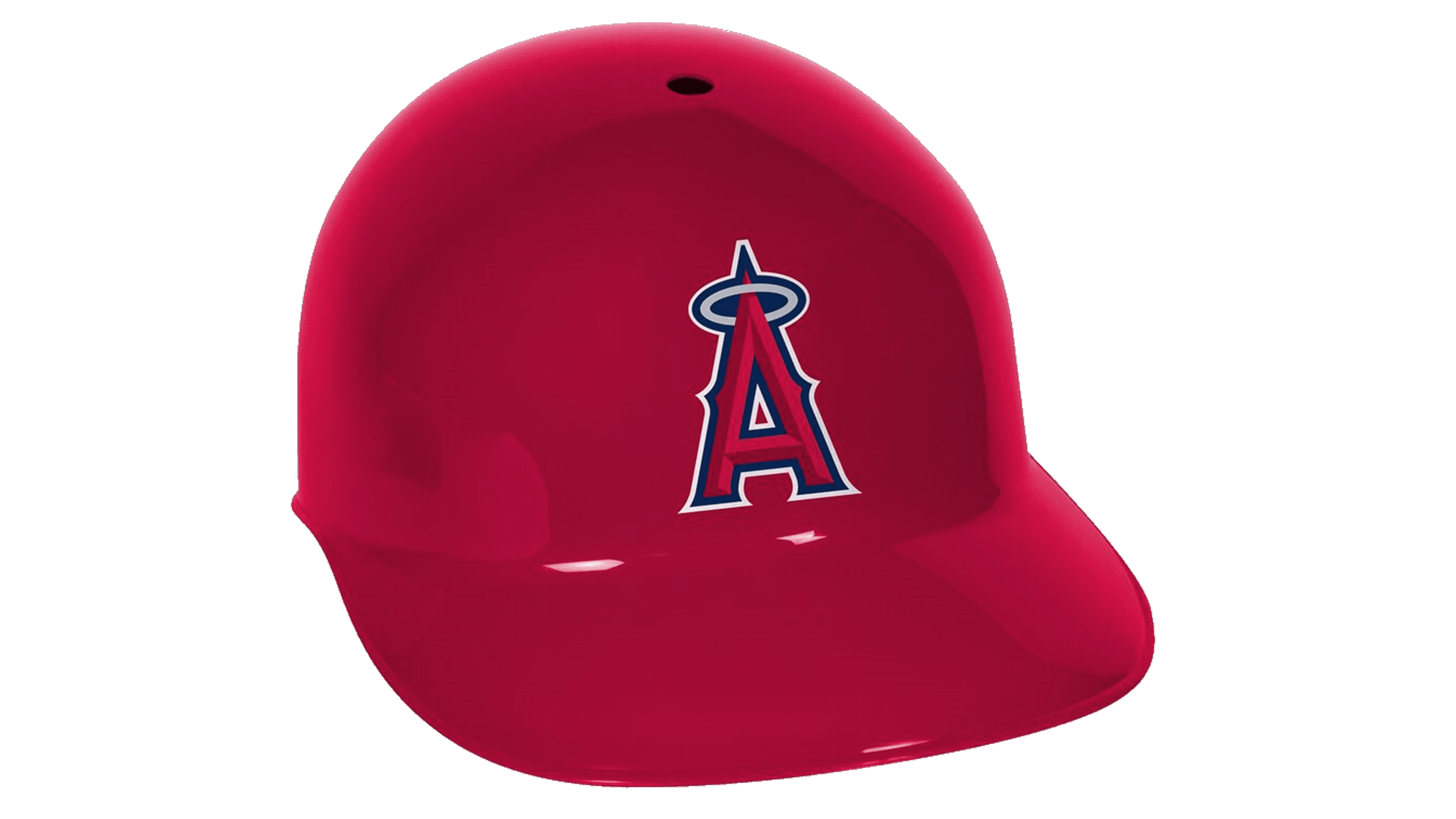
The modern helmets and caps have traditionally been almost completely red, although it wasn’t always the case. Before, the team heavily used dark blue both in branding and their uniforms. As a result, there were plenty of helmets of this color and caps of mixed red and dark blue.
Uniform History
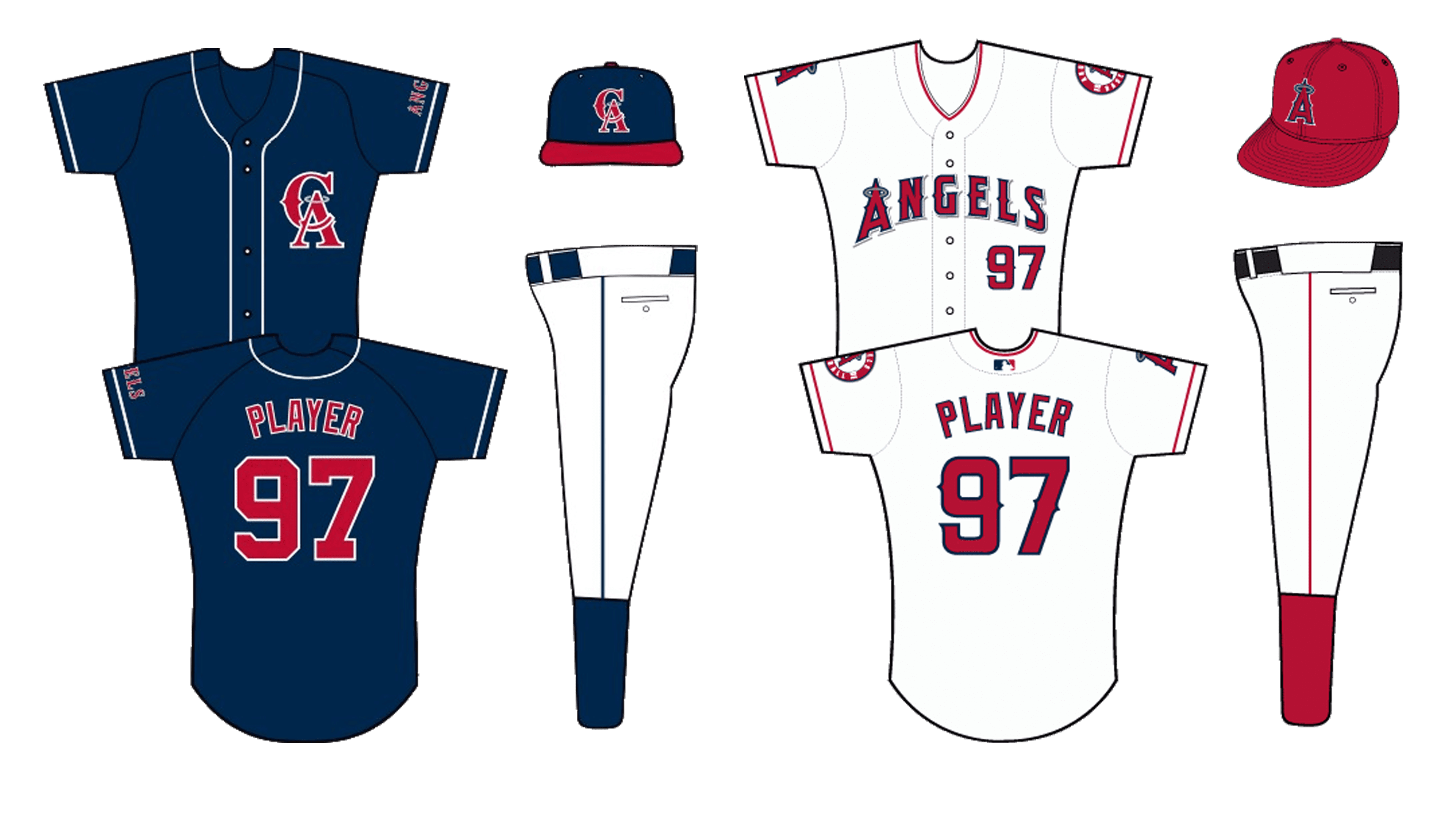
Most of their uniforms are principally white with some colorful additions. The contemporary designs heavily use the color red as such secondary addition, and nothing else. However, in the past the team was very liberal with dark blue, either coloring the sleeves with that or painting the whole jersey blue.
Los Angeles Angels of Anaheim Colors
MIDNIGHT BLUE
HEX COLOR: #003263;
RGB: (0,50,99)
CMYK: (100,86,34,25)
PANTONE: PMS 2955 C
RED
HEX COLOR: #BA0021;
RGB: (186,0,33)
CMYK: (18,100,99,10)
PANTONE: PMS 200 C
MAROON
HEX COLOR: #862633;
RGB: (134,38,51)
CMYK: (31,94,73,31)
PANTONE: PMS 202 C
SILVER
HEX COLOR: #C4CED4;
RGB: (196,206,212)
CMYK: (23,13,12,0)
PANTONE: PMS 538 C