Los Angeles Clippers is an American basketball team from Los Angeles. It’s one of the relatively younger clubs, being around since just the 70s. According to the NBA power rankings, they are considered amongst the stronger teams currently. Despite this, they are often overshadowed in fame by their neighbors, the Lakers.
Who owns Los Angeles Clippers? Steve Ballmer is a major owner of this club. He’s considered one of the richest Americans, with a net worth of $70+ billion.
History Logo
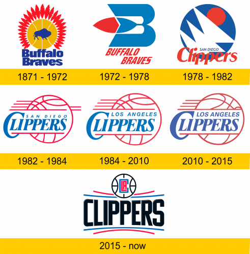
The club was created in 1970 in New York as ‘Buffalo Braves’. By 1978, they moved to West Coast and changed name to ‘Clippers’, after a model of sail ships. It wasn’t until 1984 that they finally settled in Los Angeles. Weirdly, they don’t actually use all that much ship aesthetic in their branding.
1971 – 1972
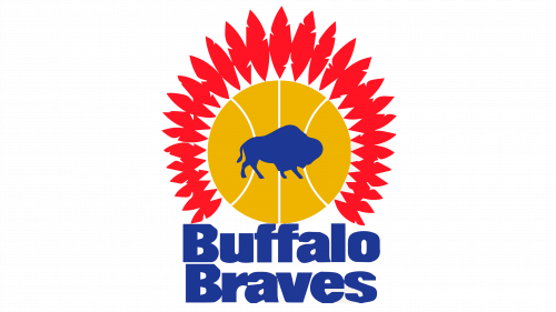
The original logo pictured a yellow circle (with white lines to look like a basketball) with stylized red feathers all around it (‘braves’ basically means ‘Indian warriors’), and in its middle it held a blue silhouette of a bison. The club name was written right below in thick, blue letters.
1972 – 1978
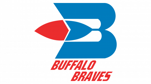
For 1972, they arranged a light blue ‘B’, but they made it wider, bolder and removed the middle part. In its place, they put a feather – blue on the right and red where it goes beyond the letter. The name ‘Buffalo Braves’ was again placed right below, except in all capital red letters this time.
1978 – 1982
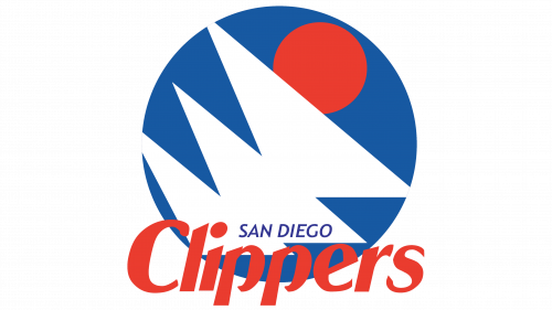
In 1978, they went to San Diego and changed the name to ‘Clippers’. That’s why the logo is now a blue circle with three white triangles (sails) and a smaller red circle (sun) above them. They also wrote ‘San Diego’ in small blue text in the bottom of the lower sail, and the ‘Clippers’ in the bigger red characters right beneath.
1982 – 1984
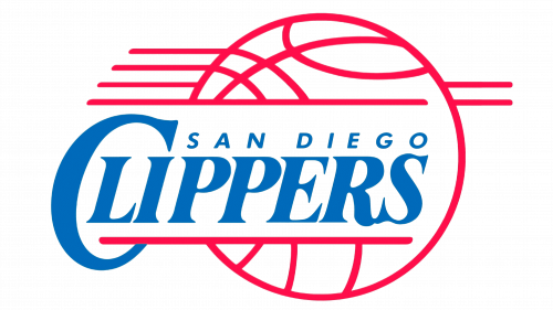
For several years, the San Diego team used a red outline of a basketball with much of its center section removed to place the club’s name there. Like before, it consisted of a small ‘San Diego’ piece above, and the name proper right below. Both were blue, but the main word also enjoyed an elegant, serif font with a huge ‘C’.
1984 – 2010
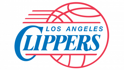
In 1984, they simply replaced ‘San Diego’ with ‘Los Angeles’ upon their move to that place. Comparably, the letters were a bit higher and bigger.
2010 – 2015
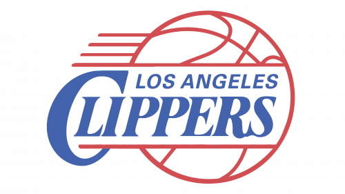
In 2010, they made them even bolder and bigger, but the central difference was the color shade – the blue letters turned to lilac instead.
2015 – today
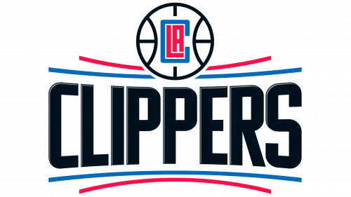
The 2015 design is a new one. It’s a bit black ‘Clippers’ word written in all capital letters. Above and below, it’s joined by two curved lines each: two blue and two red ones – although the top is also disrupted by a black ball styled as a basketball. In its middle, they put a rectangular ‘C’ confining in itself the letters ‘L’ & ‘A’.
Uniform History
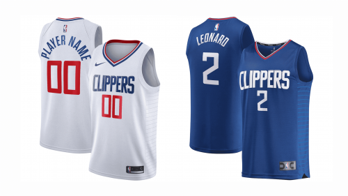
For most of their history, the Clippers home colors were white with red & blue letters. The away uniforms, by comparison begun with brown ‘Buffalo’ gear, then went on to blue, which was then followed by red and again by blue. Nowadays, they mostly use blue for away and black for alts.
Los Angeles Clippers Colors
RED
PANTONE: 186
HEX COLOR: #C8102E;
RGB: (200,16,46)
CMYK: (2,100,85,6)
BLUE
PANTONE: 7687
HEX COLOR: #1D428A;
RGB: (29,66,148)
CMYK: (100,78,0,18)
SILVER
PANTONE: COOL GRAY 5
HEX COLOR: #BEC0C2;
RGB: (190,192,194)
CMYK: (0,0,0,29)
BLACK
HEX COLOR: #000000;
RGB: (0,0,0)
HSB: (204,100,0)
CMYK: (75,68,67,90)


