Dodgers are a baseball team from Los Angeles, America. The team is regarded as one of the best in MLB, and especially on the West Coast. For the longest time, they were actually a Brooklyn (in Ney York) team, and only made a move to California in the 1950s after one of the purchases.
Who owns Los Angeles Dodgers? The team is owned by a consortium called Guggenheim Baseball Management. The biggest stake belongs to the Stan Kasten.
History Logo
![]()
The team was established in 1883 in Brooklyn, New York. Over the years, they’ve changed their name plenty of time, with ‘Dodgers’ becoming an eventual choice in 1913 and then again in 1932. It wasn’t until 1958 that they were renamed to ‘Los Angeles Dodgers’ after moving to California, however.
1899 – 1901
![]()
The initial logo was a capital letter ‘B’, colored in red and written in a rather Gothic style, with lots strange twists and structures all over the place.
1902 – 1908
![]()
The color changed from red to blue in 1902.
1909 – 1909
![]()
The 1909 is really just the previous logo but simplified a lot. It still has the weird Gothic shapes, but it’s also more straightforward.
1910 – 1910
![]()
Later, they basically made it darker and surrounded it by four lines in a rhomb-like formation.
1911 – 1911
![]()
For the 1911 season, the logo was largely the same, except the color was bleached a bit.
1912 – 1913
![]()
Then, the emblem was slightly bleached again, except this time they also cut the line segments that stuck out.
1914 – 1925
![]()
They basically took the same blue ‘B’ and made it rounder and bolder for two decades.
1926 – 1927
![]()
In 1926, they made the ‘B’ narrower and put it inside a blue rhomb (also rather narrow).
1928 – 1928
![]()
In 1928, they replaced the rhomb with a red circle and returned the letter some of its width.
1929 – 1929
![]()
Later, they got rid of the circle, replaced the blue with turquoise and added a red outline across the letter.
1930 – 1930
![]()
In 1930, they made it slightly thinner, turned the outline blue and the coloring itself red.
1931 – 1931
![]()
A season later, they tried a more rectangular, bulky style, colored in turquoise with a layer of blue on the outside.
1932 – 1936
![]()
This one is pretty much just a reused 1914 variant.
1937 – 1937
![]()
In 1937, they tried a different ‘B’ again – a much thinner, rectangular and disproportioned style. This one was colored green, and it was the last single-letter variation they made.
1938 – 1944
![]()
In 1938, they tried to base their logo on their actual team name, the ‘Dodgers’. They’ve written it in a simple blue cursive with a long underlining stroke, and then skewed the thing diagonally.
1945 – 1957
![]()
The 1945 emblem has a thinner and not as strongly skewed writing, as well as a new element behind – a flying red baseball with linear trail following it.
1958 – 1967
![]()
They basically returned the letters to their former thickness in 1958, in addition to extending the trail of the ball behind and making it less detailed (the stitches partially disappeared).
1968 – 1971
![]()
In 1968, the letters became even bolder and thicker, while most of the logo stayed as it was.
1972 – 1978
![]()
The blue in the letters became just marginally darker by 1972.
1979 – 2011
![]()
The 1979’s one change was that everything on the logo became much thinner than before, and that’s it.
2012 – today
![]()
The coloring became visibly paler in 2012, both for the ball and the name. Moreover, red parts got thicker again.
Uniform History
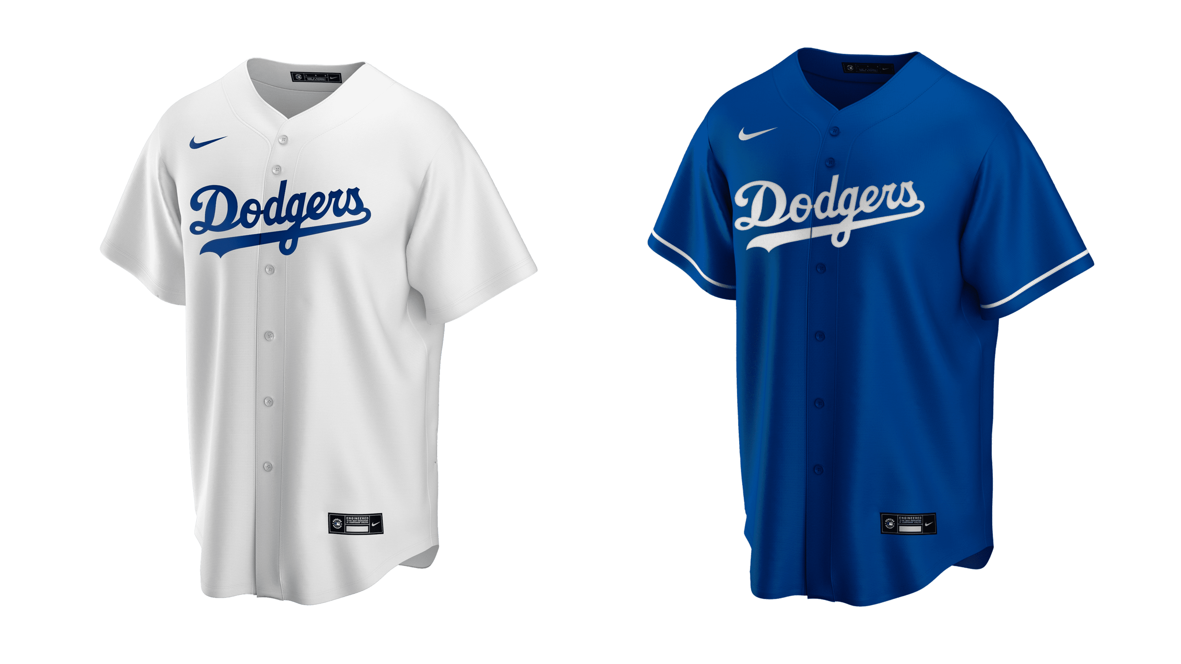
The team’s uniforms were consistently white or grey throughout the history (with the exception of the blue boots, belts and caps. However, there were several periods when their shirts were blue or turquoise. The turquoise ones in particular were used just prior and several times after the adoption of the 2012 logo.
Los Angeles Dodgers Colors
DODGER BLUE
PANTONE: PMS 294 C
HEX COLOR: #005A9C;
RGB: (0, 90, 156)
CMYK: (100, 56, 0, 18.5)
RED
PANTONE: PMS 185 C
HEX COLOR: #EF3E42;
RGB: (239, 62, 66)
CMYK: (0, 91, 76, 0)
SILVER
PANTONE: PMS 877 C
HEX: #A5ACAF;
RGB: (191, 192, 191)
CMYK: (5, 0, 0, 20)