Montreal Canadiens is a Canadian hockey team. They won the Stanley Cup championship 24 times, which is more than any other club did. Canadiens are also one of the six teams that composed the original National Hockey League. The hub of the team is located in the Bell Centre in Montréal, Canada.
Who owns Montreal Canadiens? The team belongs to the Molson family. They’ve been the owners since 1978.
History Logo
The team was formed in the year 1909 by J. Ambrose O’Brien. That time it was to be the team, composed of the French Canadian players, was mostly owned by the community and was used to promote the Quebecois cultural heritage. That’s why the team was named and stylized in the French manner and colors.
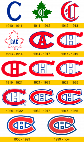
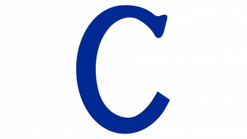
1910 – 1911
The very first logotype used as the primal for the team’s visual identity of that time was the simple letter ‘C’ of the blue color, with no background.
1911 – 1912
The second brand mark of the Canadiens team had completely another style. It consisted of the white-colored letter ‘C’ of the gothic typeface. It stood on the green Canadian leaf.
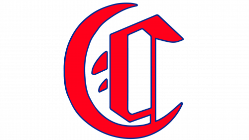
1912 – 1913
A bit sooner, the team changed its visual identity again. That time, the team introduced the familiar gothic character ‘C’, featured in the brisk red color with the very thin dark-blue outline.
1913 – 1914
The next logo was depicted with the using of familiar leaf, but in the thin line with no inner part, so the whole image of the leaf looked white with the red contour. Over it, there was the abbreviation ‘CAC’ (‘Club athlétique Canadien’) of the blue sans-serif font.
1914 – 1917
The 1914 logo was the first with the iconic ‘C’. Though it didn’t depict all the team features, this logotype became the basis for the further ones. It had the red-colored ‘C’ with the long form and blue outline. There was also the character ‘A’ in the center part of the image. This letter was the shorting from ‘Athlétique’.
1917 – 1919
One more team brand mark consisted of the familiar long ‘C’, but with some changes. First, in the center of the logo, the letter ‘H’ took place instead of ‘A’. It meant ‘Hockey’. Second, the blue contour form the 1914 was placed inside the big ‘C’ and visually attended it, so the whole image composed the abbreviation ‘CHC’, or ‘Club de hockey Canadien’.
1919 – 1921
The following team trademark featured the full red ‘C’ with the character ‘H’, coming from it. For some reason, they removed the blue contour.
1921 – 1923
The 1923 logotype consisted of the letter ‘C’, which was very similar to the 1917 look. However, the brand logo designers straightened the two ‘C’s from below, so the entire thing looked and felt like it is even longer.
1923 – 1925
In 1925, they decided to get the 1917 ‘C’ back as the primal logo, but not on the long time.
1925 – 1932
The 1925 logo of the brand had a curious feature: the blue line in this logo encircled all the red part, so the double-‘c’ pattern was even more distinctive than it was in the previous versions.
1932 – 1947
One more brand logo depicts the same double-‘c’ image with the ‘H’ character in the center, but that time the blue line became fatter.
1947 – 1956
Once more the brand designers modified the Canadiens’ logo. The change was that the upper tails of the letters ‘C’ were straightened, so they looked more massive and strong.
1956 – 1999
The 1956 trademark had a bit different image of the ‘c’, which contrasted to the other logos’ background. The symbol was grouped and thickened, so our double-‘c’ logo looked distinctive and powerful.
1999 – today
The 1999 logo has the same picture, but in darker shades.
Helmet History
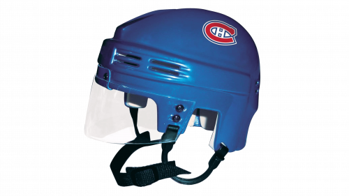
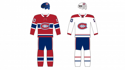
The helmet appeared in the list of the Montréal Canadiens’ equipment in the year 1977. That time it was the simple helmet, which color could be white or blue (depended on the situation). As the time passed, the team’s identity designers added the logo on the side of the helmet and also there was placed plastic glass board to protect the player’s face.
Uniform History
The team’s uniform appeared in 1917 and consisted of the pants and red-blue-and-white jersey, and the logo or player number in the center. Generally, the uniform didn’t get major changes except making it wider or the small mods. But the 2021 jerseys carry Reebok uniform design with the wide enough hands and body part.
Montréal Canadien Colors
RED
PANTONE: PMS 187 C
HEX COLOR: #AF1E2D;
RGB: (175, 30, 45)
CMYK: (0, 85, 72, 35)
BLUE
PANTONE: PMS 2758 C
HEX COLOR: #192168;
RGB: (25, 33, 104)
CMYK: (100, 69, 0, 62)

