NASCAR is the national stock car racing association. Established in 1947 by combining semi-professional racing in the southeastern United States into a single championship. About 1,500 races are held annually in 48 US states under the auspices of NASCAR.
The association has offices in Canada, Mexico and Europe. Ranked the second most popular sports competition in the United States, behind only the NFL.
Meaning and history
The first NASCAR logos contained several distinctive elements of racing competition. Until 1975, they depicted the silhouettes of two Ford sports cars. This model was the most popular at the stage of the formation of the association.
In 1979, the NASCAR series was televised for the first time. Before that, the association completely redesigned its logo – simplified it and made it more catchy and memorable.
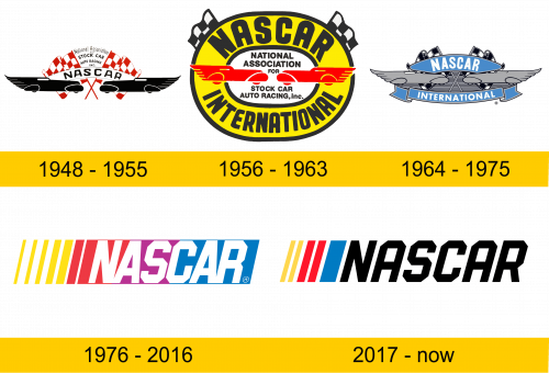
1948 – 1955
The first logo of the association was remembered primarily for its inventive design. Two silhouettes of cars, standing face to face, symbolized the irreconcilable spirit of competition in the championship. Their rear end was styled like fenders, hinting at high speed.
In the center there is a white arched ribbon with the abbreviation of association, made in a strict black font. Behind the ribbon were placed 2 flags with a red and white checkered panel – a symbol of the start of the races. And between them in 5 rows they fit the full name of the company. Each row was assigned a separate font.
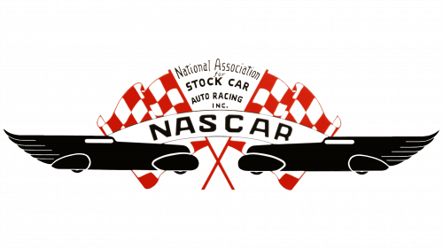
1956 – 1963
In 1959, the huge Daytona International Speedway, built specifically for NASCAR racing, was opened. The most prestigious auto race of the association, the Daytona 500, is still held at the circuit. The construction was led by the International Speedway Corporation. Therefore, the name of the race track uses the phrase “International Speedway”. And in the logo – “INTERNATIONAL”.
Three years before the opening of the circuit, the association stylized its logo to look like a racing track. Its shape was made in the form of a circular race track (traditional for the NASCAR series) with a free transparent cavity in the middle. The yellow background was highlighted with a thick black outline on the inside and outside of the logo. The starting flags were changed to finish flags (black and white checkered panel), reduced in size and placed on opposite upper corners. We changed the design of 2 cars, repainted it in red, but did not change the general concept.
The size of both labels has been increased. The abbreviation of the association stood out especially clearly. The lettering on the inside of the logo is now in a strict sans-serif typeface.
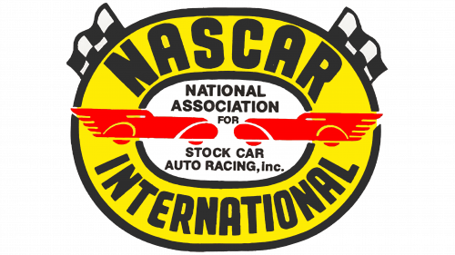
1964 – 1975
By 1964, the association decided to revert to the original logo design with some changes. The color scheme has been redesigned in dark grays and blues. A stylized radiator grille from a car was placed in the background. The flags have been redesigned and given a three-dimensional look.
The full name of the association was removed. The arched ribbon with the acronym was moved to the top of the logo, and a long double-ended ribbon with the inscription “INTERNATIONAL” was added at the bottom. The font has changed slightly, becoming smoother and more elongated.
1976 – 2016
Shortly before the first live television broadcast of the race, the association decides to completely redesign the logo. By giving it a modern and memorable look, the designers hoped to win the attention of viewers. And they succeeded.
The logo was given the shape of a narrow rectangle with a slight diagonal offset. Now it consisted of only two elements: the “NASCAR” lettering and multi-colored stripes of different widths. The stripes were of 4 colors: yellow, red, purple and blue. All of them (with the exception of purple) formed the basis of the color scheme of logos of the past. A unique typeface was developed with curly cutouts on the letters “S” and “C”.
2017 – today
The logo remained unchanged until 2017, then it was decided to modernize and refine it. The number of stripes was reduced and moved to the left behind the inscription. Removed the purple color. All letters of the lettering have resulted in a single unique style with flowing cutouts at the corners.
Color and font
In the process of evolution, the NASCAR logo has made the transition from complex design elements to simple ones. At the same time, the association was able to preserve the elements of dynamics and racing themes, which are now conveyed using the font: elongated lines and letters, as well as a slight tilt of all elements to the right.
The unique color palette reflects all the basic colors of past logos.


