The National Basketball Association of the USA and Canada is one of the four largest professional sports leagues. The popularity of basketball began to skyrocket just a few years after James Naismith’s concept of the game in 1891. The NBA was founded in 1946, and emerged as a result of the merger of the National Basketball League and the Basketball Association.
Meaning and history
The NBA emblem is spectacular, dynamic, it is well known to all basketball fans. Emphasizes the leadership of the National Basketball Association, its financial success and authority in the sports world. According to the developer – international advertising firm Siegel + Gale, the logo brings the association more than $ 3 billion annually.
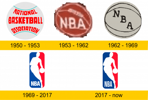
1950 – 1953
The visual basis of the first logo was a basketball with red lettering, the location of which emphasized the traditional design of the sports accessory.
1953 – 1962
The lack of dynamics, good readability and the so-called i-stopper in the emblem became the reasons for the design change after three years. The growing popularity of the association made it possible to use not a long name, but only an abbreviation: NBA. The image became brighter, easier to perceive, and better remembered.
1962 – 1969
There have been minor changes. The general concept remained the same, the designers changed only the color scheme of the logo and the font style. The logo has become more conservative.
1969 – 2017
In the late 60s, the NBA competed fiercely with another popular American basketball association. In order to regain the leading position, the National Basketball Association changed a number of rules for joining the league. It was also decided to completely update the emblem. The old logo is outdated morally, no longer corresponds to the fast paced spirit of the times.
The new style was supposed to emphasize identity, become a symbol of renewal and leadership. The task was entrusted to Alan Siegel, the founder of a major New York-based advertising agency. In 1969, he designed a new logo for the NBA in rich red and blue tones that accentuate the athlete’s white silhouette. He dribbles with his left hand, is quick, independent and free. At the heart of the visual image is the legendary basketball player Jerry West. The source of inspiration for the developer was an old photograph in a popular sports magazine. The emblem turned out to be dynamic and bright, fully reflecting the essence of the game. In the NBA, the symbol is considered abstract and does not refer to any player.
2017 – today
The old grotesque typeface has been replaced with a visually lighter and more active sans-serif typeface. The general concept was supplemented with the final touch, became the most complex, complete, filled with movement.
Color and font
In 2021, the NBA emblem looks the same as in 2017. The blue and red color combination of the logo emphasizes the fusion of two powerful elements. Blue stands for excellence and grace, while red symbolizes passion, courage and determination. The white silhouette embodies nobility, elegance and purity. For the title, the designer used a well-read, energetic cut-off typeface. The special dynamics of the popular logo and the absence of unnecessary details make its capacious image easily recognizable.


