New York Rangers are the sports team that professionally plays ice hockey. They were one of the six commands to compose the initial list of National Hockey League members. For many times, they won the top-tier awards, such as the Stanley Cup championship trophy.
Who owns New York Rangers? Rangers are owned by the Madison Square Garden Sports. The chairman of this company is James Dolan.
History Logo
The club was formed in the year of 1926. The name was recommended by the press, when it found out about a new sports team. Rangers were one of the paramilitary forces in Texas, where the team’s founder spent most of his youth. This name was universally considered fancy by the public, hence it had to stay.
1927 – 1935
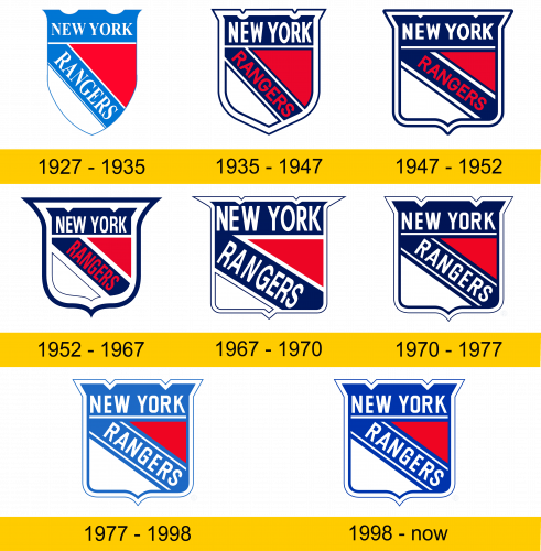
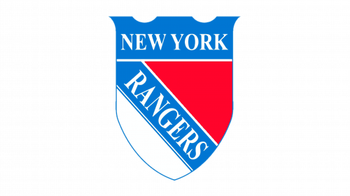
The initial logo depicted the simple bright blue-red-and-white shield. On the upper part of the shield, there was the inscription ‘New York’, of the blue typeface with serifs. Below it, the team’s name ‘Rangers’ was showing off in diagonal position. It had the same font as the upper inscription.
1935 – 1947
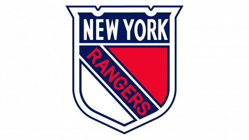
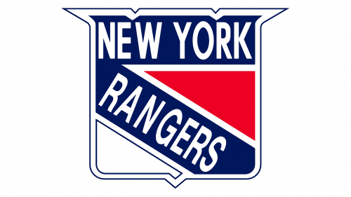
The shield was met greatly by the public, and the team’s brand designers decided to improve it. Due to the bold outline and a bit straighter shape, the shield became more massive. The colors were also turned to the darker style. As for the words, so, their serif font was replaced by the strong sans-serif typeface. The part ‘Rangers’ became red as well.
1947 – 1952
The 1947 logotype consisted of generally the same elements as the 1935 logo, but their design was more angular and wider. The shield stayed with its strong style.
1952 – 1967
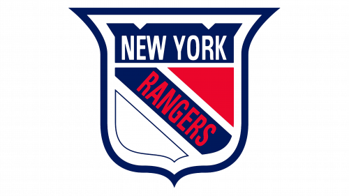
One more team’s brand mark also depicted the similar features to the previous version, but with some modifications. That time, it had the very brisk dark blue outline that encircled the shield, which, in its turn, consisted of several separated from each other parts, similar to the ones that were in the previous logos.
1967 – 1970
In the 1967 logotype, the brand identity designers of the team returned the inscriptions to its initial white color, and also made them wider. The outline of the shield became white, gained the sharper shape and was even stronger and more square-like than the previous versions.
1970 – 1977
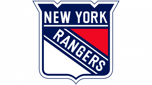
In the year 1970, the brand mark was changed again. It lost its sharp tails in the upper part, and was a bit narrowed. The blue area of the logotype from that moment was single, and didn’t have separated parts at all. Also, the old red and white figures completely gained triangular shapes and were put inside the shield.
1977 – 1998
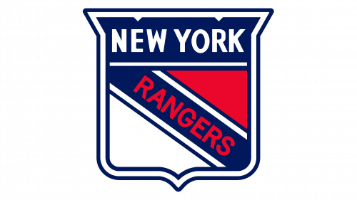
That version of the logotype was successful and gained the green light to be improved. Soon after, it gained the bright color palette, similar to the one that was in the very first logotype.
1998 – today
The 1998 logotype has something middle between the bright and dark blue colors.
Helmet History
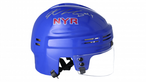
The helmet was first introduced in 1978 in two colors: white and blue. In 1990, designers placed the team’s blue name on the side of the helmet. The team didn’t make major changes in the helmet design, except for the branding part, which reflected them changing their name.
Uniform History
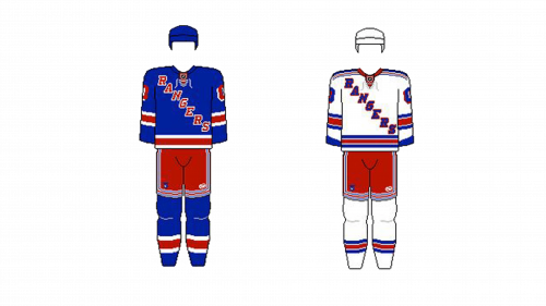
The team uniform appeared in 1926. It had the blue color with red and white lines. The name was in the center of the jersey. For the next years, the only mods of the uniform were brightening or darkening of the color and changing the center images. The latest uniforms are prominent for their many curved stripes.
New York Rangers Colors
BLUE
PANTONE: PMS 286 C
HEX COLOR: #0038A8;
RGB: (0,56,168)
CMYK: (100,88,0,0)
RED
PANTONE: 186 C
HEX COLOR: #CE1126;
RGB: (206,17,38)
CMYK: (2,100,85,6)
WHITE
HEX COLOR: #FFFFFF;
RGB: (255,255,255)
CMYK: (0,0,0,0)

