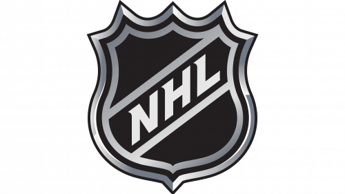
The NHL is a professional sports organization that includes the strongest hockey teams from the United States and Canada. It was formed back in 1917 and is one of the first professional hockey leagues in the world. According to the results of the championship, the most prestigious hockey trophy – the Stanley Cup – is played out annually. The NHL regular season is followed by numerous fans around the world.
Meaning and history
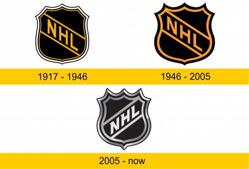
1917 – 1946
The coat of arms of the first league logo had a rather sleek shape with subtle protrusions. The logo had 3 types of outline: black, white and yellow. Two parallel yellow lines were attached to the yellow outline. Thus, a rectangular frame was obtained, inside which was the name of the league.
The name was also executed in yellow. Three capital letters in bold were placed diagonally from the top left to the bottom right. The letters consisted only of straight lines without the use of serifs. The inscription stood out most clearly against the black background.
1946 – 2005
By 1946, minor changes were made to the logo. They decided to simplify the frame, leaving only 2 wide contours (black and orange). The shape of the coat of arms became slightly wider and shorter, acute-angled protrusions appeared. The elements of the shield have moved slightly towards the left corner.
All the yellow lettering and lines were given an orange tint. This increased the contrast against the black background. The font was balanced and expanded. As a result, the logo looks more professional and elegant.
2005 – today
The 2005 NHL rebranding influenced the logo design the most. The number of outlines increased again to 4. The frame of the logo was complicated with a gradient shade, it became more voluminous and took on a modern look.
Orange was replaced by silver gray. Combined with a black background, it should look more stylish than orange. The direction of the inscription was changed to the opposite (from bottom to top). This is a symbol of the league’s growth and progress.
The font of the logo has also changed, it has become denser and sharper. The letters were tilted to the right and added short triangular serifs on the left side.
Color and font
The color scheme of the NHL league logos usually adjusts to current design trends. Only the black background of the emblem remains unchanged. However, the color change does not in any way violate the overall well-established harmony of the logo elements.
The slanted font was originally chosen to balance the placement of the letters within the logo. Subsequently, the adaptation of the inscription to the shape of the shield formed its own unique font style.

