Parramatta Eels is an Australian rugby team from Sydney, more accurately – the city’s suburb of Parramatta. They pay under the National Rugby League and often occupy high places in it, making them amongst the most powerful rugby clubs in the country. They are, however, not really the most popular bunch.
Who owns Parramatta Eels? The team is owned by Oliver Bou Farhat. He’s an Australian billionaire and a businessman.
History Logo
![]()
The team was established in 1946 in Parramatta, a prominent suburb within Sydney. At first, they were simply named ‘Parramatta’, and the ‘Eels’ part was added in the 70s. The area famously means something like ‘the Eel Place’ in the native language, which gave birth to their contemporary moniker.
1946 – 1974
![]()
The original logo was a simple paint drawing of two men (black silhouettes) fishing with a spear from the boat. The water is green, for some reason (probably to signify eels), there’s a brown cliff nearby and a yellow sailing ship far away. The whole drawing is confined within a blue circular frame.
1974 – 1979
![]()
The 1974 logo was a more refined emblem of a man (also a dark silhouette) leaning on the spear. This image was depicted on a white front of what seems to be a drum with blue scaly sides and golden rims. Beneath it, there is a ribbon, also colored in blue and sporting golden rims. Over it, they wrote ‘Parramatta’ in thin yellow letters.
1979 – 2000
![]()
In 1979, they adopted a new design: a blue circle with several white droplet shapes inside, the team’s name written in white along the edges and an eel protruding from the ‘Eels’ part in the bottom. The eel itself was mostly yellow with a lot of blue elements and a green line along its back.
2000 – 2004
![]()
In 2000, they instead adopted a more realistic picture of an eel, colored light blue and with yellow fins. The same color combination was used with the big word ‘Eels’ right above the creature. Its style was different: uppercase letters with many pointed appendages protruding from their different parts. There was also the word ‘Parramatta’ written in black right above the main writing.
2004 – 2011
![]()
They changed the course again in 2004. This time, they mostly returned to the old style of the eel, but changed its position so that you could only see the upper body, the head and the tail. The rest was obstructed by the team’s name written in soft letters, colored blue and outlined with yellow.
2011 – today
![]()
This logo mostly reuses the old 1979 design, but with a much paler color palette and the numbers ‘19’ & ‘47’ written in yellow on each side of the frame.
Uniform History
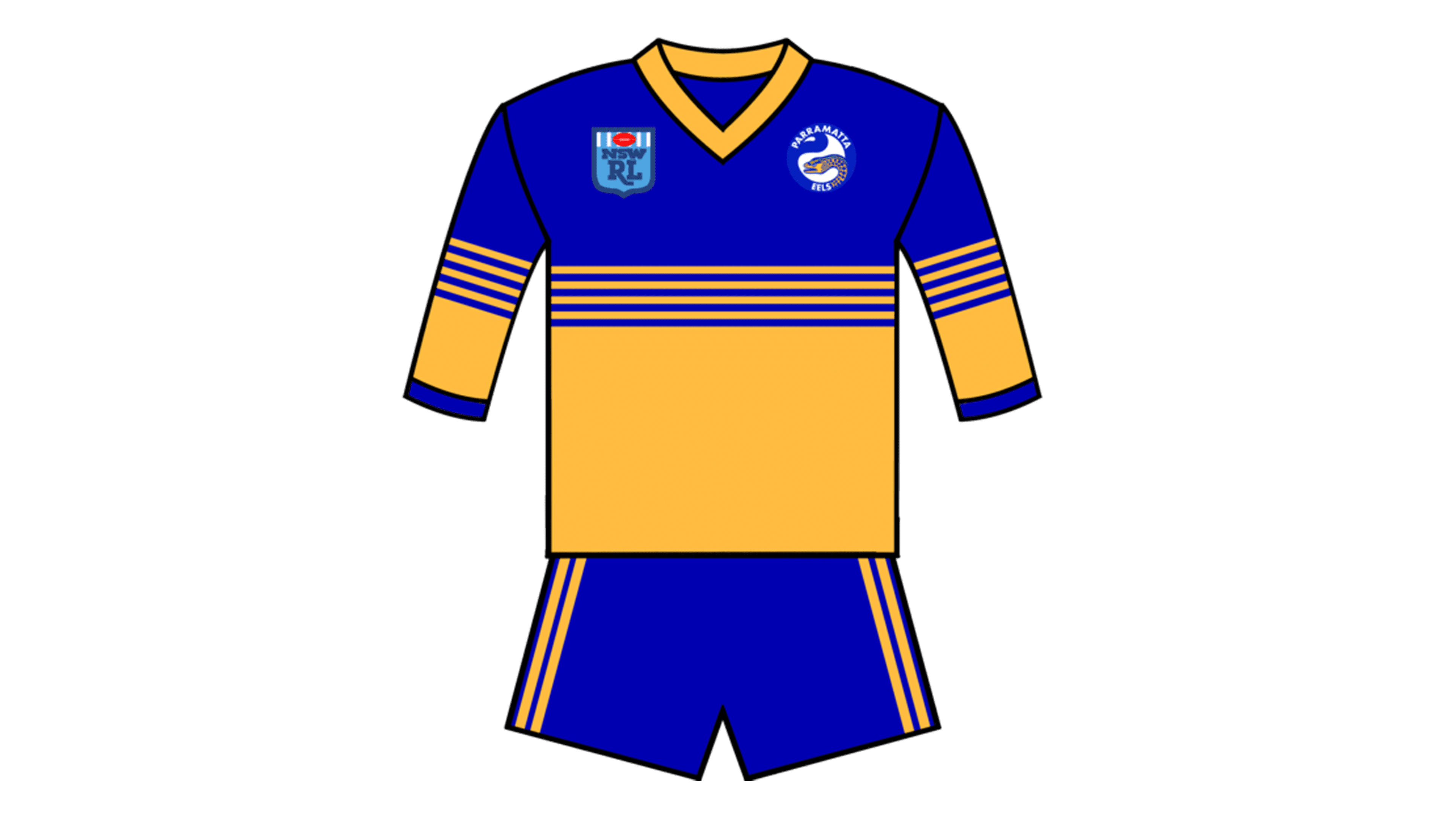
The team has always primarily used yellow or blue. Most of their historic uniforms were yellow shirts with blue or white sorts. As of late, they started to instead favor the blue tops with various shorts (mostly white). The color choices aren’t homogenous, however – there’s always some blue in yellow or some yellow in blue.