The Premier League is one of the strongest and most spectacular football leagues in the world. The clubs participating in the English National Championship are very popular with fans, sports experts and journalists. There are 20 professional football teams in the tournament grid, some of them periodically fly to the lower division if they have scored fewer points.
Meaning and history
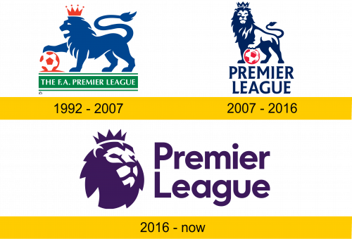
The image of the majestic lion has been featured on the logo of the English championship since 1992. The emblem has changed three times. The lion on the logo personifies greatness, courage, nobility, constancy, and also symbolizes belonging to a monarchical state.
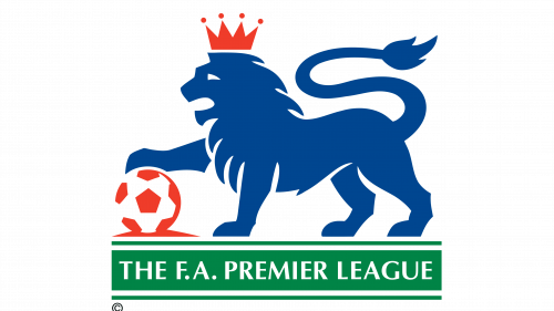
1992 – 2007
The 1992 logo featured a stylized dark blue lion touching a soccer ball with its paw. On his head was a crown with teeth and characteristic points. At the bottom of the emblem was a platform with double lines. An inscription dedicated to the tournament was written on the platform.
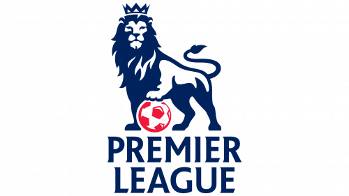
2007 – 2016
The emblem of the English championship succumbed to minor changes in 2007. It had smooth lines and well-defined contours. The logo featured a lion, made in blue and white tonnes. Above him towered a small crown, which had the same color as the lion. The blue tint was placed at the bottom of the emblem. The letters were distinguished by a memorable and stylized font.
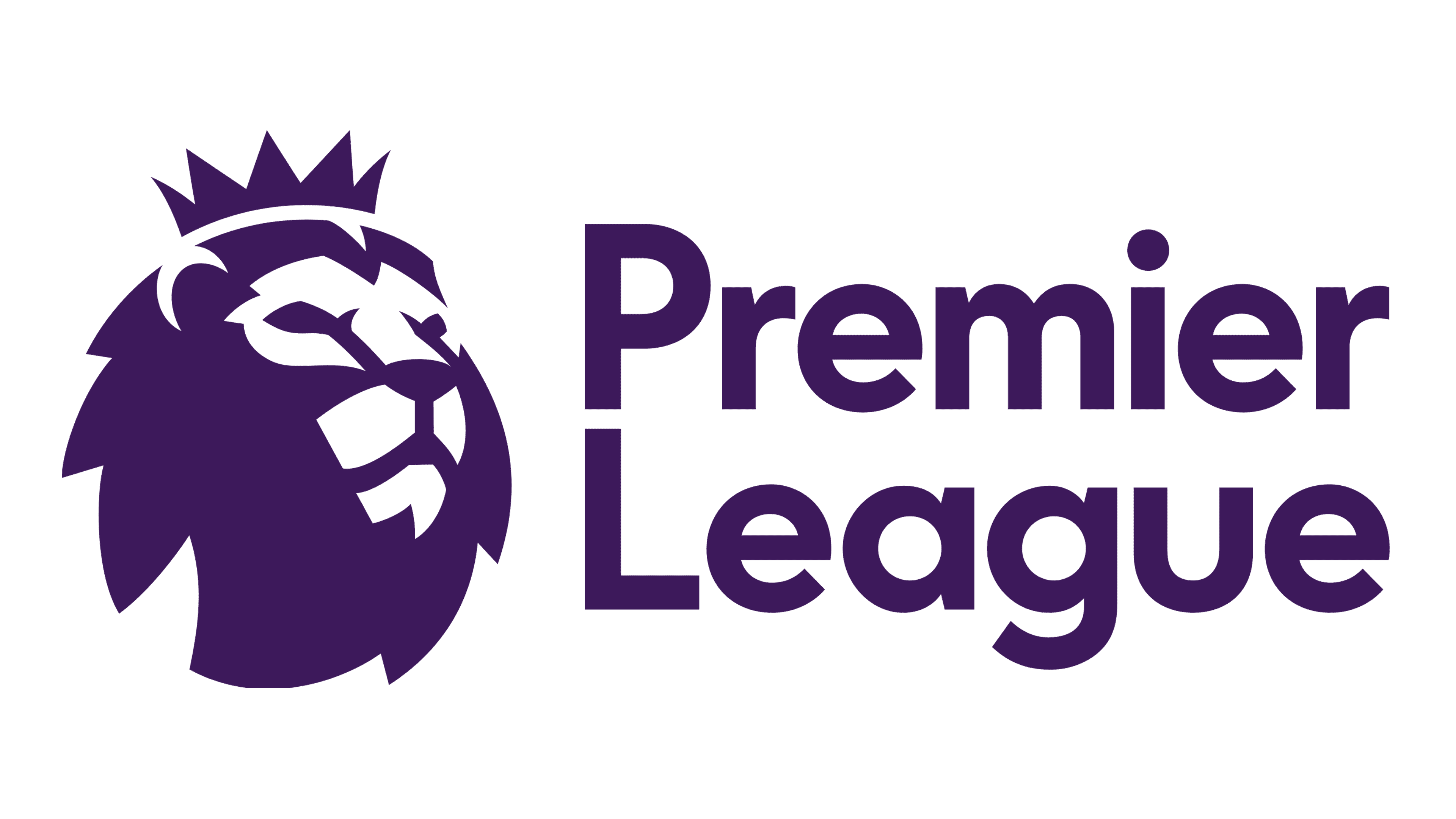
2016 – today
In 2016, the symbol of the English National Championship was re-branded. He began to look more elegant and colorful compared to previous versions. A nice touch to the design was the choice of purple, which is easy on the eye and allows you to focus on the image. The emblem bears a large lion’s head, turned towards the inscription. The pointed typeface blends harmoniously with the original design. Despite the absence of a soccer ball, the logo attracts with its modern design. He demonstrates self-sacrifice and greatness of spirit.
Color and font
The font looks unusual and presentable. Each letter has been modified and improved. Initially, the colors used were blue and green. The combination of dark purple and white colors is relevant for 2016. These colors are understandable to the majority, with them the logo is easily perceived.

