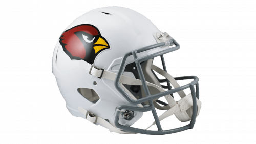
St. Louis Cardinals is a baseball team from Missouri. Being established in the 1880s, it’s one of the oldest still active MLB members in America. Within it, they compete inside the Central Division of the National League. Despite the age, they are still considered one of the best in the Division.
Who owns St. Louis Cardinals? William Dewitt Jr. is an owner. Prior to that, the team belonged to the Anheuser-Busch Company for a long time.
History Logo
The team was created in 1882 in St. Louis, Missouri. There, they’ve been initially known as ‘Browns’, and even before the official creation, the city had the team called ‘Brown Stockings’. The current name came at the close of the 19th century, and it doesn’t have any deeper meaning save the fact the fans liked the sound of it.
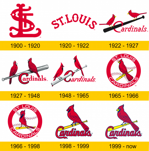
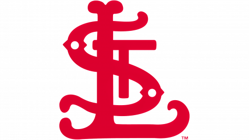
1900 – 1920
The original logo was a collection of letters ‘S’, ‘T’ and ‘L’. They were written with a rather peculiar bone-like style. The single chosen color is red, copying the plumage of a cardinal bird.
1920 – 1922
In 1920, they adopted a simpler, more common emblem. It basically depicted the city’s name written in red letters at a curve. It also somewhat resembled bones, except in a less intrusive way.
1922 – 1927
A different design followed in 1922, and it was pretty much in use until the 60s, in different variations. This one depicts two cardinal birds perching on the opposite ends of a black baseball bat. They also seemingly hooked the capital ‘C’ from the team’s name onto the bat. The name itself is red and otherwise uses a simple serif type.
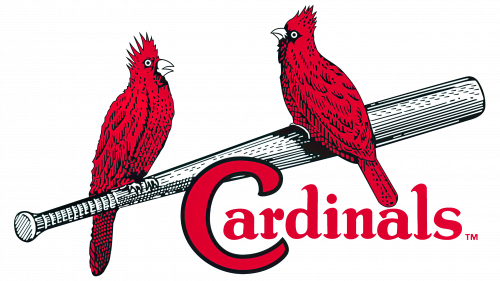
1927 – 1948
This time, they opted to reshuffle the design a bit, making the birds bigger, adding more effort to them and also repainting the bat grey (and also turning it around). The writing stayed mostly intact, except they unhooked the ‘C’ and gave it black outline for some reason.
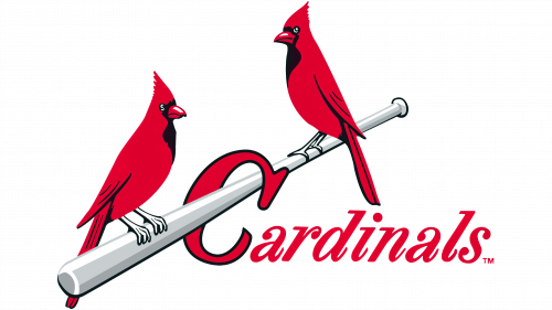
1948 – 1965
In 1948, they turned the bat back the other way and scaled down much of the nuance it had. Other than that, the design stayed as before. The ‘C’ was again hooked onto the bat, and they also shrunk the other letters and strongly tilted them.
1965 – 1966
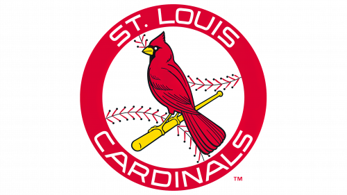
The 1965 instead pictures one cardinal bird sitting on a shorter, yellow baseball bat as a centerpiece of the logo. It was put in the middle of a white circle, stylized as a baseball and encircled by a big red frame. There, they put the team’s full name in white letters – along the top and bottom edges piecemeal.
1966 – 1998
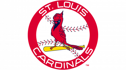
Some parts changed a year later. In particular, the bird was repainted facing an onlooker and wearing a red baseball cap. They also slightly repositioned the bat and made it yet smaller. Nothing else changed that much.
1998 – 1999
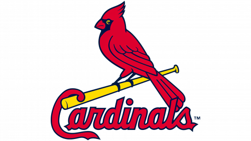
The 1998 redesign is actually more based on the old 1965 bird design, although not completely. It has a different color scheme, proportions and a pose. It’s still rather similar, though. The bat was also lengthened and rotated clockwise a bit. They also used the old ‘hooking’ move here, in which the capital letter of the word ‘Cardinals’ in placed as if onto the bat, and the rest of the letters are nearby as usual.
The new font is also a bit more cursive, and they actually bothered to make sure the all the characters are the same style and color – light red this time.
1999 – today
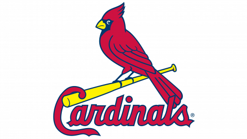
The one visible change that happened in 1999 is that they made the color scheme as a whole lighter. Moreover, the beak turned to yellow, and that’s about it.
Helmet History
The headwear of the Cardinals (including the caps and the helmets) has been mostly red throughout their history. There have been odd partially black helmets in the past, but even they had red visors. The tone of the red could also vary, but the majority of designs used a very basic bright red.
Uniform History
Cardinals are known for wearing almost completely white uniforms, with just occasional red elements. It’s been their main designs for a very long time. Besides that, they also used completely grey uniforms for away matches and light blue ones with red sleeves as popular alternative variants.
St. Louis Cardinals
CARDINAL RED
PANTONE: PMS 200 C
HEX COLOR: #C41E3A;
RGB: (196, 30, 58)
CMYK: (0, 100, 65, 15)
NAVY
PANTONE: PMS 289 C
HEX COLOR: #0C2340;
RGB: (12, 35, 64)
CMYK: (100, 60, 0, 56)
YELLOW
PANTONE: PMS 107 C
HEX COLOR: #FEDB00;
RGB: (254, 219, 0)
CMYK: (0, 0, 100, 0)
WHITE
HEX CODE: #FFFFFF;
RGB: (255, 255, 255)
CMYK: (0, 0, 0, 0)


