Toronto Blue Jays is a Canadian baseball team. They are one of the younger teams, created when Major League Baseball decided to expand towards Canada. Toronto is located near the American border, so there are prime conditions for this sport, actually. They aren’t particularly powerful in the overall ranking, however.
Who owns Toronto Blue Jays? The team is managed by Rogers Communications. It’s a large Canadian media and TV company.
History Logo
![]()
The team was created in 1977 in Toronto, province Ontario. They are named after a common and popular bird found throughout North America, called blue jay. Their branding primarily uses the navy blue color, in addition to the usual Canadian colors of white and red.
1977 – 1997
![]()
The initial logo pictured a head of the blue jay bird drawn in a somewhat symmetric, visually pleasing way. They put it over the usual red-outlined baseball. Its right side grew into a maple leaf, placed, as a result, immediately to the head’s right. Around the ball, the team’s name was written in full using twin blue lines as material for letters.
1997 – 2003
![]()
The head was carried into this design in a very similar form. That being said, they added a lot of shades and volume to it, in addition to some new design decisions. The ball stayed in the same place, but was slightly repositioned and given a blue outline instead. The leaf, however, moved to behind both of these elements and grew massively.
2003 – 2004
![]()
The 2003 logo depicts a more humanoid sort of jay, keeping a baseball bat rested on its shoulder and joggling the ball in the other. They also decided to put the maple leaf part on its arm this time, as a tattoo. All of it is illustrated around a big capital ‘T’ colored red, for ‘Toronto’.
2004 – 2012
![]()
In 2004, they decided to experiment a bit more and used a head once more. This time, however, it had aggressive features and human eyes, which made it rather less realistic. It was put immediately to the left of the big silver ‘Jays’ written in cursive and outlined in several layers of blue.
2012 – 2019
![]()
In 2012, they decided to use their original logo again but with a few changes. For instance, both the ball and the bird got slightly redesigned, the letters in ‘Toronto’ became normal instead of being made of twin lines. The twin lines, meanwhile, were also used to create a circle around the emblem proper.
2019 – today
![]()
This time, they removed everything except the bird’s head and its maple leaf, but changed nothing about them.
Helmet History
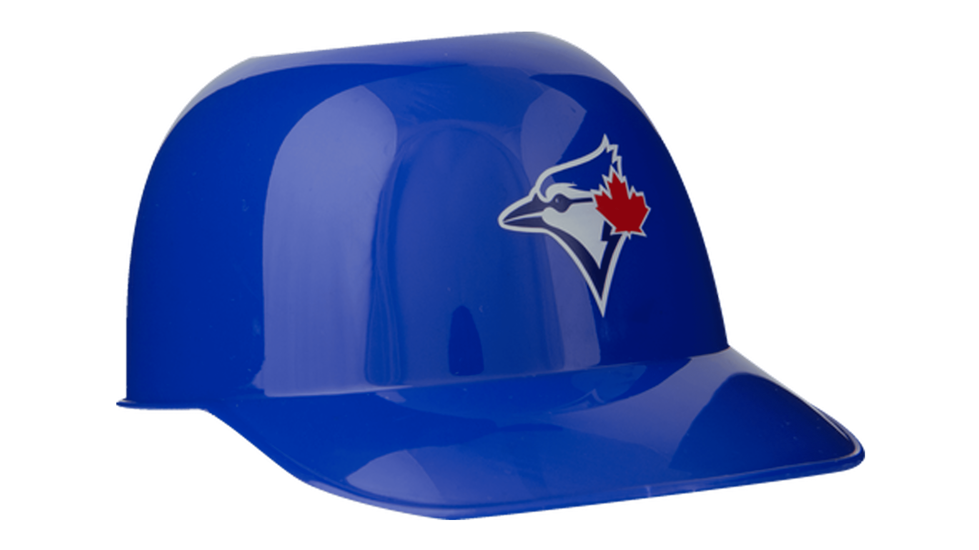
Most of the historic Jay caps and helmets are blue (navy or royal blue). That being said, there are plenty of alternatives. The most common are blue with white forehead areas, as well as dark blue with some lighter blue additions. Fully blue helmets, however, are by far the most popular.
Uniform History
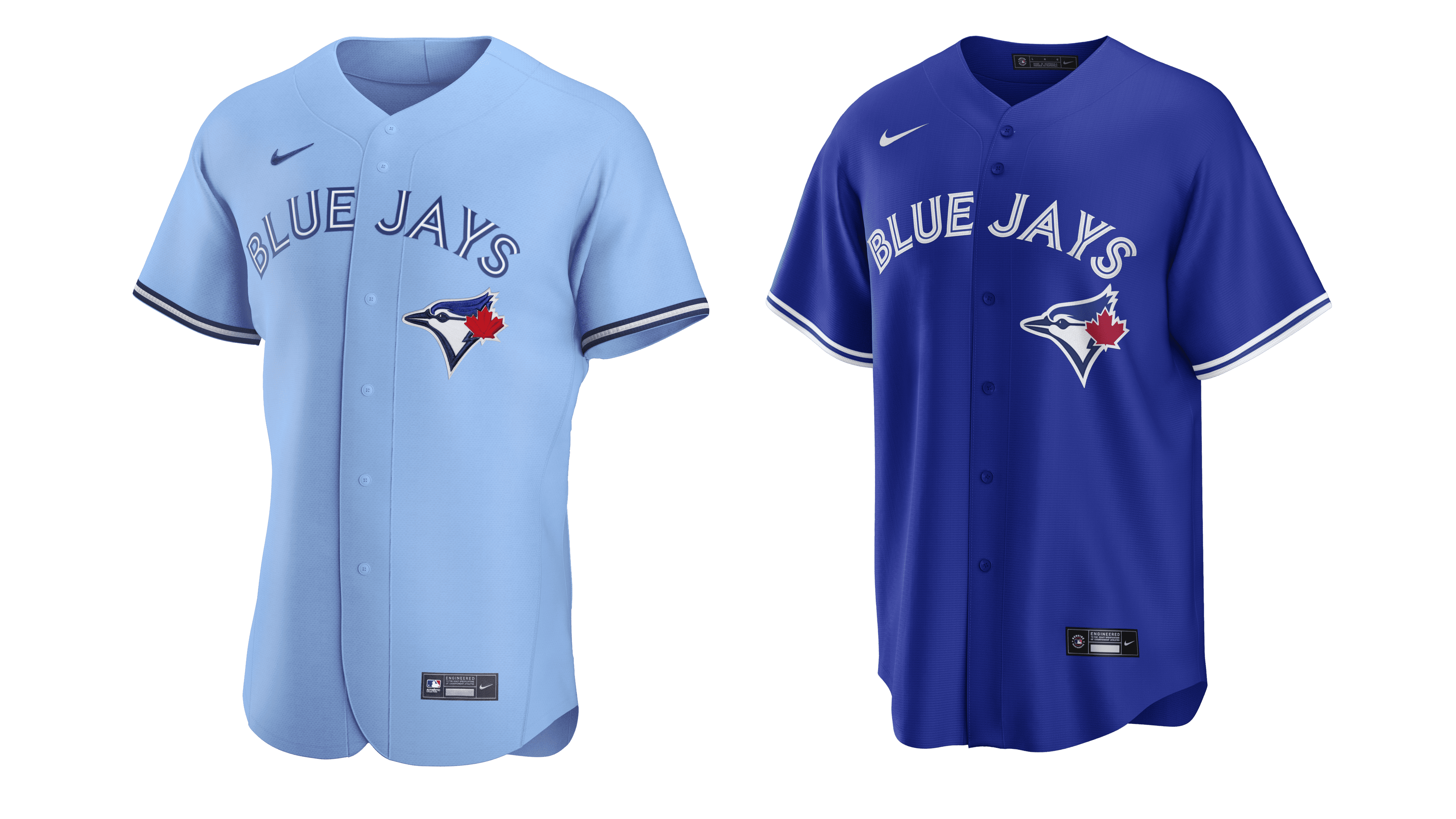
The majority of their jerseys is either dark blue or light blue, paired with white pants. However, there are also plenty white and grey uniforms. In fact, whites (with some blue additives) were by far the most frequently used home design, followed by blue and then by grey garb.
Toronto Blue Jays Colors
PANTONE: PMS 4152 C
HEX COLOR: #134A8E;
RGB: (19, 74, 142)
HSB: (211, 86, 55)
CMYK: (100, 80, 14, 2)
NAVY BLUE
PANTONE: PMS 534 C
HEX COLOR: #1D2D5C;
RGB: (29, 45, 92)
HSB: (224, 68, 36)
CMYK: (100, 91, 35, 28)
RED
PANTONE: PMS 485 C
HEX COLOR: #E8291C;
RGB: (232, 41, 28)
HSB: (2, 87, 90)
CMYK: (3, 97, 100, 0)