White Sox is an American baseball team from Chicago. They are one of the iconic baseball teams of the 20th century. Competing in the Central division of the American League, they are currently one of the top-ranking teams in that region. They have an almost 50/50 ratio of wins and losses.
Who owns White Sox? A businessman called Jerry Reinsdorf owns the team. He’s been doing it since 1981 after he bought them.
History Logo
![]()
The team was established in 1900 in Chicago, Illinois. On account of their blank uniforms, they were initially called ‘White Stockings’, thereafter changing it to ‘White Sox’ (likely an homage to the older Boston team called ‘Red Sox’). Interesting, the modern team usually wears black socks.
1900 – 1902
![]()
Originally, the logo was simply a big letter ‘C’ written in a sharp, geometrical style and colored red.
1902 – 1904
![]()
The second one was instead a blue letter made into a peculiar wide shape with parts that made it look metal.
1904 – 1905
![]()
Then, they decided to give it a more round, tall proportion. It was rather slim, had twisted tips and a triangular element in the middle section.
1905 – 1906
![]()
In this edition, they just slightly rearranged the letter from before, fiddling mostly with the middle area. They extended it into a rhomb and granted it a hollow space in the middle.
1906 – 1908
![]()
In 1906, they gave it a rounder, wider shape. It was for the most part consistently slim, except for one tip that resembled a harpoon for some reason.
1908 – 1909
![]()
Later on, they simply added a pair of triangular attachments on each side of the middle section.
1909 – 1912
![]()
The attachments were gone this time, although they also made the letter noticeably slimmer (with a somewhat thicker bottom).
1912 – 1916
![]()
In 1912, they introduced a new design: a big blue ‘S’ with the lowercase ‘o’ and ‘x’ in the space inside the letter. The former was very much similar to the ‘C’ from previous emblems.
1916 – 1918
![]()
They basically made the ‘S’ smoother and slimmer and changed little else.
1918 – 1931
![]()
The 1918 was a big step up. This time, they used a bronze badge with a blue grid signifying the globe inside it. On the frame around, they wrote ‘world champions’ in blue & ‘White Sox’ in white. Out of the top right corner of the grid and all the way down, there stretched a big white stocking.
Crowning the badge was a bronze eagle statue. Behind, there was an American flag waving around the central piece. Below, they placed two crossed baseball bats and a baseball. Lastly, the word ‘Chicago’ was written in a strange blue style below all of it.
1931 – 1935
![]()
This logo is three letters ‘S’, ‘O’ and ‘X’ organized diagonally and colored red (with dark blue outlines). There was also a yellow bat following the letters’ trajectory behind them, as well as a baseball inside the ‘O’.
1935 – 1938
![]()
They returned to the old pre – 1918 design, although the font changed to a strange artistic font with a lot of jagged extensions and attachments, as well as a lot of sharp edges.
1938 – 1948
![]()
The logo they adopted in 1938 was basically white blue-outlined mascot with some red details (such as the red team emblem of the kind not yet used & sleeves). He also held a massive blue baseball bat with ‘White Sox’ written in white over it. Apart from the blue grass, the only other element was a huge red baseball in the background.
1948 – 1959
![]()
The following logo depicts a flying white sock with the wings attached to its sides. It was heavily outlined in blue, and the background in general was a blue linear engraving of sky and clouds. In front of it all, the designers put the word ‘Chicago’ in the red cursive writing with white and blue outline.
1959 – 1975
![]()
The 1959 was instead a red circle with a white silhouette of a sock inside it. Moreover, much of the circle was also occupied by a drawing of a baseball player depicted in black lines.
1975 – 1981
![]()
The 1975 logo featured most notably an image of a baseball player compiled from several geometric parts and mostly colored in blue (except for the red ‘hands’). Beneath it was the word ‘Sox’ in blue, and beneath even that were inscriptions ‘Chicago’ and ‘White Sox’ in red. All three were separated from one another by thin lines in-between.
1981 – 1986
![]()
Sometime later, they decided to make the color palette slightly lighter, which was the only change this time.
1986 – 1990
![]()
In 1986, they made it darker again – even darker than the original design, actually.
1990 – today
![]()
The 1990 emblem was an original design. They basically wrote ‘Sox’ in diagonal again, although this time it was black and a more elegant, slightly Gothic style reminiscent of metal. They were visibly intertwined, and the first letter visibly dwarfed others in size. In addition to black, there was also a slight silver outline around them.
Helmet History

Most of their helmets were black, for the most part. They always put the current logo in white in the middle of the forehead area, like other teams. However, there was also preference for blue and red. In particular red was often used for visors and for outline of the letters. But some historic helmets were also red and blue.
Uniform History
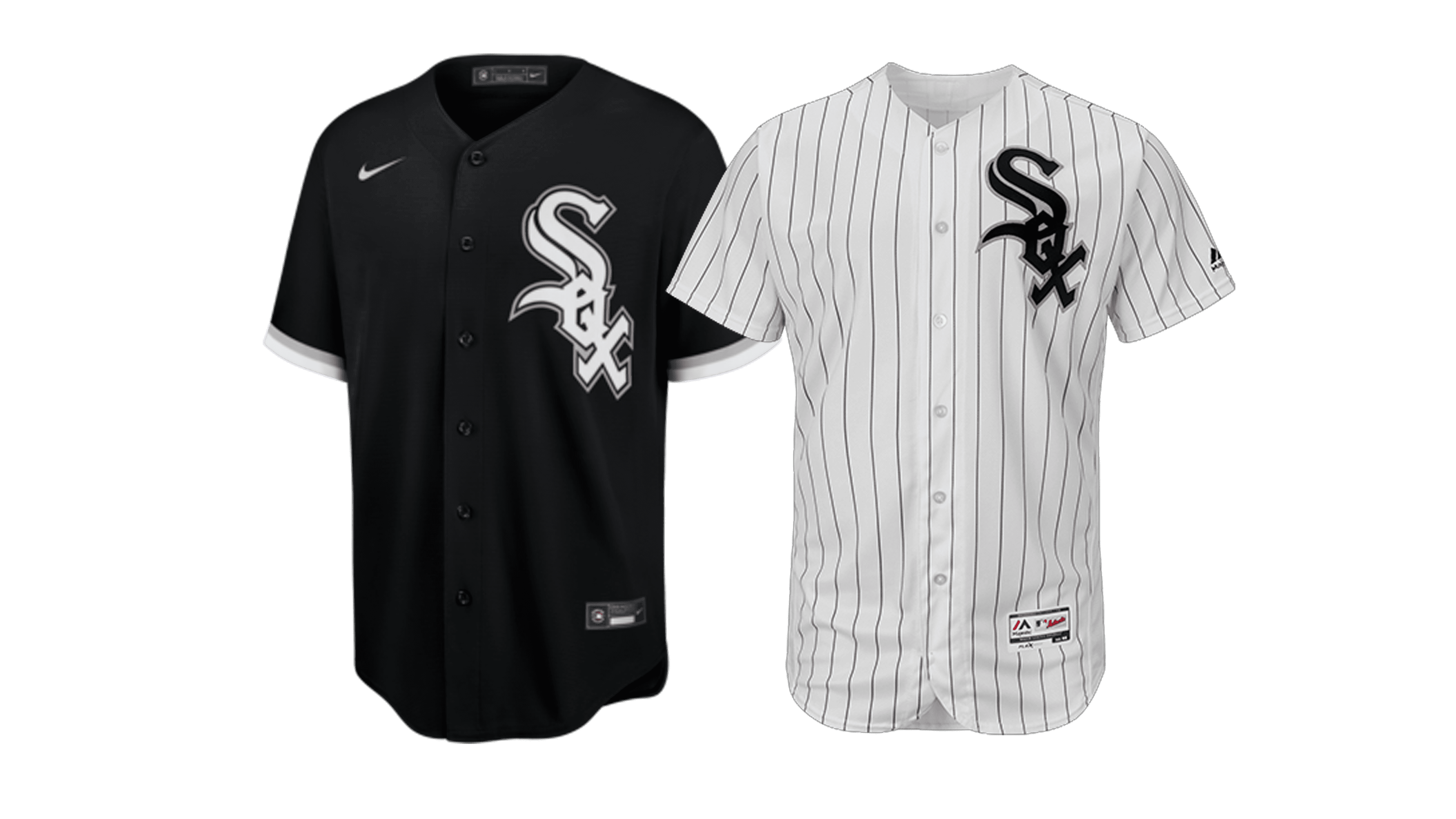
Presently, the team mostly uses white- and grey-dominated uniforms with a touch of black (for belts, socks and letters). However, they also like to wear black jerseys with white pants whenever they can. It’s their beloved alternative combination. Occasionally, they also put red there (for instance, they used white uniforms with a single black stripe across the chest, outlined in red).
White Sox Colors
BLACK
PANTONE: PROCESS BLACK
HEX COLOR: #27251F;
RGB: (39,37,31)
CMYK: (00,00,00,100)
SILVER
PANTONE: PMS 877
HEX COLOR: #C4CED4;
RGB: (196,206,212)
CMYK: (5,00,00,20)