Arsenal is one of the top football clubs of England. It’s one of the several professional teams from London, and they’ve been at it since the end of the 19th century. According to FIFA, they’ve been on the decline lately, although Arsenal is still considered one of the world top 20 teams.
Who owns Arsenal? There’s a company called Kroenke Sports & Entertainment, it’s in charge of the team. It turn, the company is owned by Stan Kroenke.
History Logo
The club was founded in 1886 by several workers of the Royal Arsenal, in one of the London’s boroughs. They initially had several variations of ‘Arsenal’ used as names, but the contemporary form was only adopted in 1919. Because of their origins, the brand uses the guns imagery very heavily.
1888 – 1922
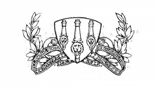
The initial logo featured a shield depicting three upright cannons with the lion heads at their bottoms. There were several variants. Some were colored and primarily used the red background for the shield, but the most popular one was just black-and-white. It is likely based off one of the earlier emblems of the Royal Arsenal itself.
1922 – 1925
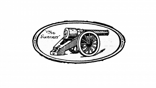
The first real emblem dates back to 1922. It was an oval drawing, mostly in black-and-white. The inner space was mostly white, except for an engraved 19th century cannon, as well as a cursive ‘the Gunners’ inscription to the left. It wasn’t the official name at the time, but a popular nickname the team had among the fans.
1925 – 1930
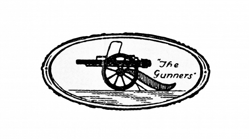
In 1925, they used a similar design. The cannon was a more contemporary type, and much thicker with black. ‘The Gunners’ (in quotations) moved to the right, while the gun aimed to the left this time.
1930 – 1936
They basically took the cannon from the previous logotype and put it onto a shield. The top of it was occupied by it, and the rest was given to the club acronym (‘A.F.C.’), as well as the year ‘1930’ below. Save for the cannon and the white background, everything was red.
1936 – 1949
The 1936 design was instead a red rhomb with black space inside. On this black space, they added a triangle and an octagon without the two right-most lines cut out. These were supposed to be an ‘A’ (for ‘Arsenal’) and ‘C’ (for ‘Club’). In the very middle, there was also a small football. All described above was red.
1949 – 1994
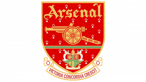
In 1949, they again adopted a red shield, returned the gun from the previous logotypes, added the word ‘Arsenal’ above it (in a more elegant, Gothic style), as well as the coat of arms of Islington, their home borough – everything in red.
There were also several details, such the borough motto ‘In God we trust’ below the Islington shield and the club’s own: ‘Victory grows from harmony’ – both in Latin.
1994 – 1996
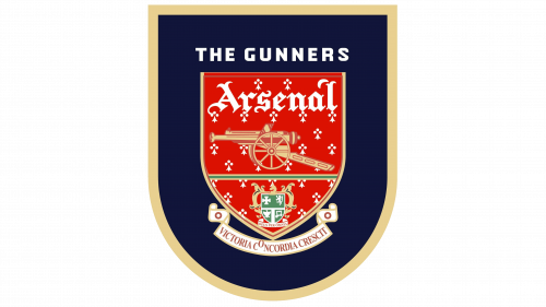
The emblem was mostly reused, but colored in more than just red. The background was red, but the gun and several other details turned to gold, while there were also green parts in the borough emblem. In the end, they put this shield onto another one much like it, but dark blue, in whose top was a red bar saying ‘the Gunners’.
1996 – 2001
While the logo was mostly unchanged, they removed the white shield outline on which the red bar as perched, alongside the bar itself. The inscription stayed, however.
2001 – 2002
This was mostly the red shield like it was in the preceding logotypes, except for several minor coloring alterations.
2002 – today
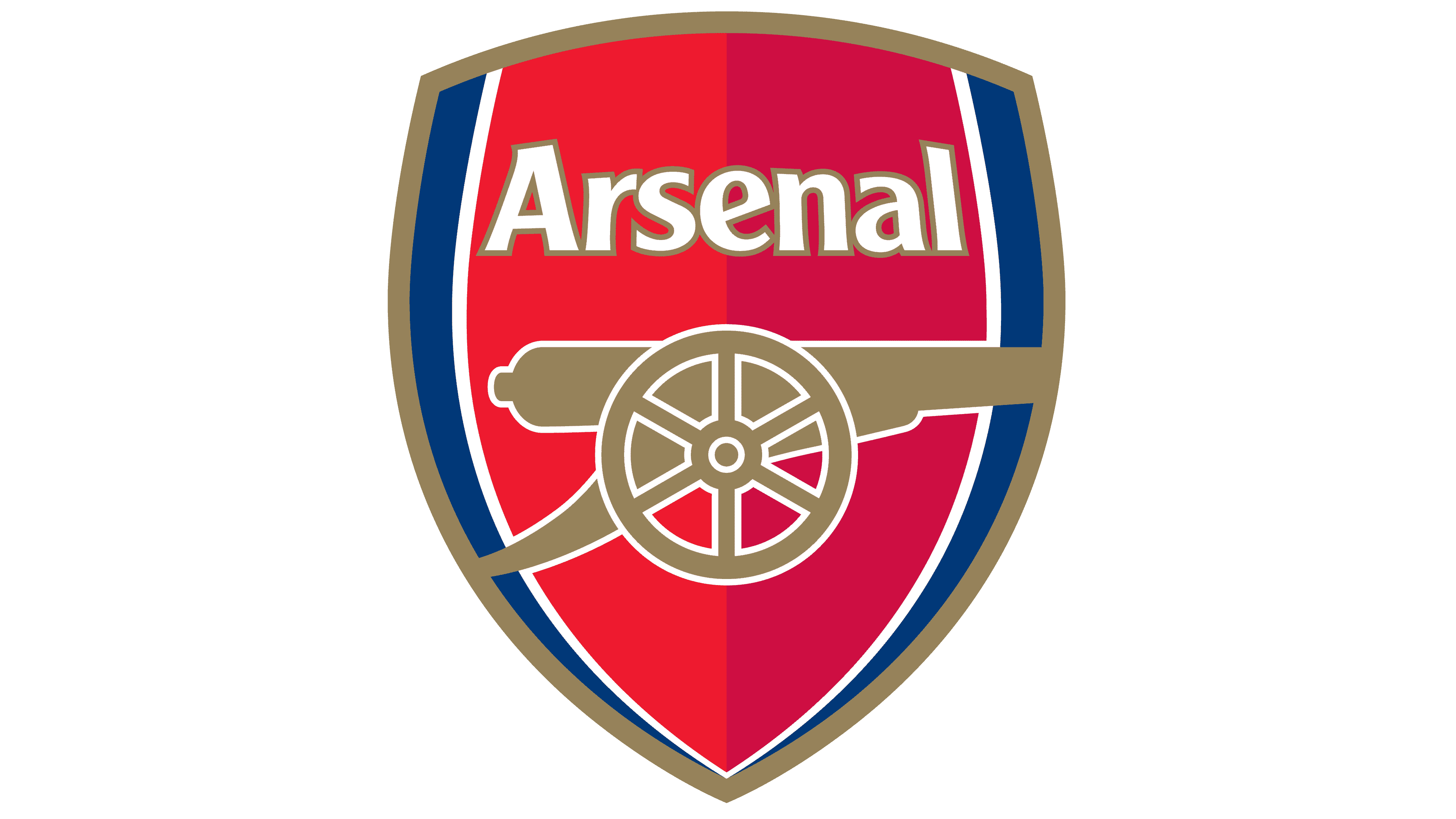
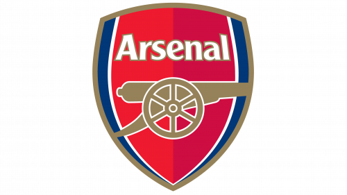
This is much like the previous designs, but simpler. It’s a bulging red shield with the blue rims. The cannon now occupies much of the space, but they actually made it more medieval, added white outlines and bleached the golden color it had before. The ‘Arsenal’ lettering turned to a mundane sans-serif colored in white.
2011 – 2012
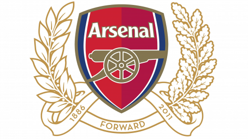
This short-lived one is pretty much the 2002 logo, but with two white gold-outlined wreaths around it, joined below by a ribbon. On the ribbon, there’s a word ‘forward’, and that’s all.
Uniform History
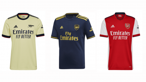
Like most old English teams, Arsenal used red for their uniforms since the beginning. Unlike them, they also white sleeves and shorts all this time. The away and alt colors varied much more, but they’ve generally been yellow, blue or both. A popular combination is a yellow shirt with blue shorts, they used it a lot before.
Arsenal Colors
RED
PANTONE: PMS 2347 C
HEX COLOR: #EF0107;
RGB: (239, 1, 7)
HSL: (356, 90, 49)
CMYK: (0, 100, 97, 6)
DARK RED
PANTONE: PMS 2035 C
HEX COLOR: #DB0007;
RGB: (219, 0, 7)
HSL: (355, 92, 44)
BLUE
PANTONE: PMS 294 C
HEX COLOR: #063672;
RGB: (6, 54, 114)
HSL: (213, 90, 24)
CMYK: (95, 53, 0, 55)
GOLD
PANTONE: PMS 4505 C
HEX COLOR: #9C824A;
RGB: (156, 130, 74)
HSL: (40, 33, 46)
CMYK: (0, 17, 53, 39)
WHITE
HEX CODE: #FFFFFF;
RGB: (255, 255, 255)
CMYK: (0, 0, 0, 0)

