Liverpool is one of the major English football clubs. It’s one of the oldest and more celebrated teams in this sport, and is a long-time rival of Manchester, another respected club. It’s regarded as one of the world’s finest clubs, although they often fall out of the world’s top-10 clubs list (according to FIFA).
Who owns Liverpool? Liverpool is owned by a company called Fenway Sports Group. It, in turn, is ruled by one John Henry.
History Logo
![]()
Liverpool was founded in 1892 in their namesake city – a rich port in the Northwestern England. Unlike many other teams, they were presented from the start as the city’s one and only professional team. The usual symbol of the club is the Liver Bird – a mythical creature that also acts as the city’s own bird.
1892 – 1950
![]()
For the longest time, the club used their hometown’s coat of arms as their own logo. The only difference was the color – the logo was completely covered in the color red. The visual elements included the central shield with the Liver Bird on it, two mermen supporting it and the Latin motto ‘God has given us these days of leisure’ below.
1940 – 1980
![]()
This was a secondary logo for four decades: the Bird shield from the coat of arms put against a white upward anchor, which in turn is put onto a red cloth. All of it is surrounded by two ribbons: a red one saying ‘Liverpool’ and a white one saying ‘Football Club’ – separated by two red-and-white balls.
1950 – 1955
![]()
This is basically the Bird shield again, except made with red and silver, with more relief and shading. On the side-note, the Bird also stretches the wings upwards here.
1955 – 1968
![]()
In 1955, they took the Bird’s silhouette from the previous logo, dumped it in red and put it inside a red vertical oval. Most of the oval’s insides are white, except for the Bird and the ‘L.F.C.’ acronym – for ‘Liverpool Football Club’.
1968 – 1987
![]()
Mostly, it’s the same logo as the 1955 one, but brighter and without the surrounding oval.
1987 – 1992
![]()
In 1987 they put the Bird instead onto a white shield with red rims, right after dumping the creature in thicker, darker red. The other two parts are: the red triangular ribbon featuring each half of the word ‘Liverpool’ on either side, as well as a pedestal below that displays ‘Football Club’ in a similar style, except in one word.
1992 – 1993
![]()
The logo began turning less and less concise since the 1992. Namely, this one is a massive white shield divided into two parts by a red line in the middle. The upper one says the club’s name in thin red letters, and the lower one displays a familiar shield with the Bird in it.
It was an anniversary logo, and thus it also had a yellow ribbon with the years ‘1892-1992’ written in red on it.
1993 – 1999
![]()
Much of the logo was carried on into 1993, but they did omit the red stripe and some other parts. Moreover, two blazing red torches were added on each side from the big shield, and the smaller Bird shield was also enlarged.
1999 – today
![]()
The most noticeable thing about the 1999 design is that they replaced the yellow parts with greenish turquoise. The Bird was taken from its smaller shield and enlarged, while the ‘Liverpool’ word up above was carefully highlighted with the red background, while the rest of the shield remained white.
2017 – 2018
![]()
For their 125 anniversary they decided to reuse the old 1968 logo: just the Bird with the club acronym below. However, this time they flattened the existing characters and added some new ones. Namely, it included the ‘125 years’ inscription below and both years of the anniversary: ‘1892’ and ‘2017’.
Everything new was just as red as the rest. However, all the characters (old ones not excluded) had a new, elegant style. It’s more linear, sophisticated and somewhat serifed.
2017 – today
![]()
The additional logo since 2017 also displays much of the anniversary logo, but without the actual anniversary additions.
Uniform History
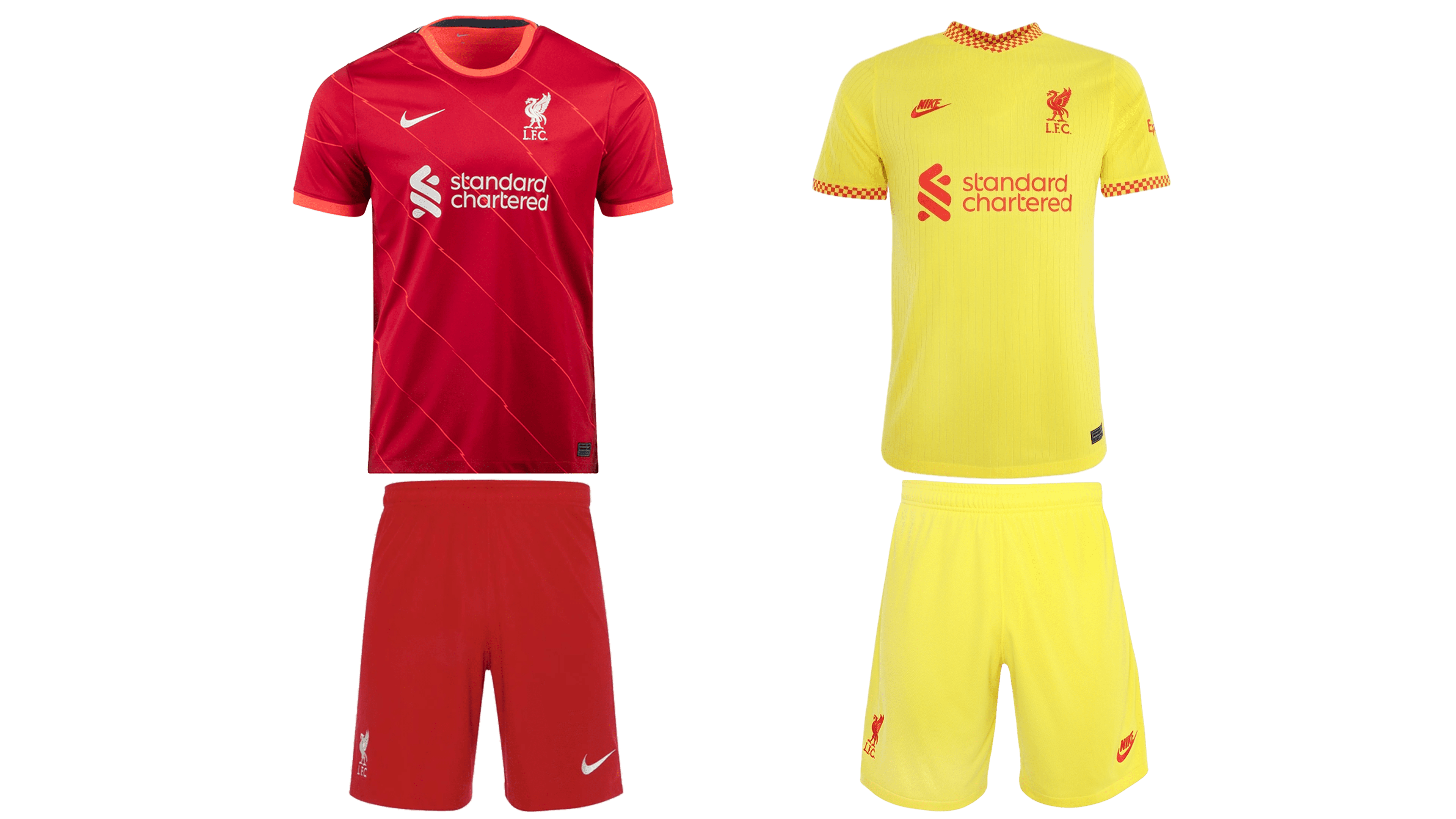
Like Manchester, Liverpool always had completely red home uniforms. It’s with the away designs that it gets interesting. Some of the older were yellow, but the newer ones are overwhelmingly turquoise/green and white in various combinations. Many of the alternative designs still feature a mix of red and yellow, however.
Liverpool Colors
RED
PANTONE: PMS 186 C
HEX COLOR: #C8102E;
RGB: (200, 16, 46)
CMYK: (2, 100, 85, 6)
GREEN
PANTONE: PMS 326 C
HEX COLOR: #00B2A9;
RGB: (0, 178, 169)
CMYK: (81, 0, 39, 0)
GOLD
PANTONE: PMS 100 C
HEX COLOR: #F6EB61;
RGB: (246, 235, 97)
CMYK: (0, 0, 56, 0)