F1 is the most prestigious racing world championship of our time, which takes place on heavy-duty sports cars. Consists of a certain number of Grand Prix stages that take place in various countries around the world. The championship is held every year, and according to its results, the winners in the individual and team events are determined. The first championship was held in 1950.
Meaning and history
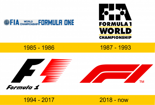
The first official F1 logo appeared only 35 years after the start of the championship. This is due to the lack of a unified regulation for Grand Prix races. Until 1980, local sports federations declared their rules for each race. Then the organizers established a championship with a single set of rules – the FIA Formula One World Championship. It wasn’t until 1985 that the official logo was introduced.
Of all the Formula 1 logos, one was truly iconic. Designed by Carter Wong in 1993, the logo lasted 23 years and then was unexpectedly replaced in 2018.
1985 – 1986
The first F1 logo got a fairly simple design. Three elements were placed in a rectangular gray frame: the abbreviation “FIA” (organizer of the championship) with its own emblem, the inscription “WORLD CHAMPIONSHIP” in two rows and the inscription “FORMULA ONE”. All inscriptions were in strict sans serif type.
The logo lasted only a year and was replaced with a brighter version.
1987 – 1993
The inscriptions that were on the previous logo have been preserved on the new one. However, the logo received a more attractive design. The inscriptions were arranged in 4 rows. The middle two rows have been underlined with a thick yellow line. The first row with the abbreviation “FIA” received a stylized car, which was an element of decoration and a continuation of the letters “F” and “A”.
Each lettering was of a different size, but the same bold type with straight sans serif lines. The designers have focused on the first row with the abbreviation “FIA”.
1994 – 2017
Then the logo was completely redesigned. The organizers decided to follow the path of simplification and were right. The new logo received cult status and gained worldwide fame and recognition.
It consisted of only two characters: “F” and “1”. The capital letter “F” was black and tilted slightly to the right to symbolize determination and strength. The red “1” symbol consisted of a plurality of speedometer arrows connected together to indicate energy, movement and speed.
2018 – today
The unexpected redesign of the logo caused a deep surprise in the public. However, there was a perfectly reasonable reason for this. The organization needed a logo that would meet the requirements for easy circulation in the digital environment. The previous one did not fit because of the stylized character “1”, which algorithms did not always identify as one.
The updated logo consists of only 3 three red lines. The straight line represents the finish line. The other 2 are competing cars that go to the finish line from around the corner. Together they form the inscription “F1”.
The simple and bold design is meant to provide more flexibility for working with digital platforms, as well as refresh the brand.
Color and font
The first F1 logos were pretty conservative. The austere and rigid sans-serif font demonstrated the high position and reliability of the world famous championship. Then the organizers changed the concept towards simplicity and symbolism. Modern logos seem simple at first, but carry deep connotations due to elaborate details.


