Miami Dolphins is an American football team from Florida. They are considered one of the better on the East Coast, and one of the most successful from the Southern states. They have joined NFL in the mid-60s during one of the expansion waves of the League, which makes them a relatively young team.
Who owns Miami Dolphins? Stephen Ross owns the overwhelming majority of the team’s stock. The other 5% belongs to minor partners.
History Logo
![]()
The team was created in 1965 in Miami, Florida. Much of their branding revolves around aquatic themes – most notably, dolphins. That’s not just abstract reference, Florida is one of the best places to see wild dolphins in America. The Southern tip of the peninsula is particularly rich with them.
1966 – 1973
![]()
The background of their logos is a white circle with orange rays covering its edges. It’s supposed to resemble the sun, as the state is famous for being sizzling hot. In front of it, on this initial logo there was a dolphin. They colored it turquoise with some white splashes and nuances all over it.
The other feature included a white helmet on its head, with orange and turquoise stripes and an orange ‘M’ on the side.
1973 – 1989
![]()
In 1973, they basically made the dolphin bigger relative to the sun, while also bleaching much of the coloring.
1989 – 1996
![]()
This time, they made the color palette much darker and brighter than before, while also lengthening the dolphin’s tail fins.
1996 – 2012
![]()
The 1996 change is by far the most significant yet. They made both the dolphin and the sun more realistic. Despite that, they are still rather grotesque and cartoonish. The layout and much of the coloring, however, stayed as before.
2012 – 2017
![]()
In 2012, they reshuffled the design of both parts again. This time, they made the shapes particularly believable, although the nuances were rather glossed over, and the dolphin in particular was in large part just a silhouette with some white sprinkles. As such, the helmet and some other parts were removed.
They also changed the positioning, placing the aquatic creature more horizontally and extending some of the rays on the sun.
2017 – today
![]()
Later, they decided to make the colors brighter and more saturated, although that was mostly applied to the orange, however.
Helmet History
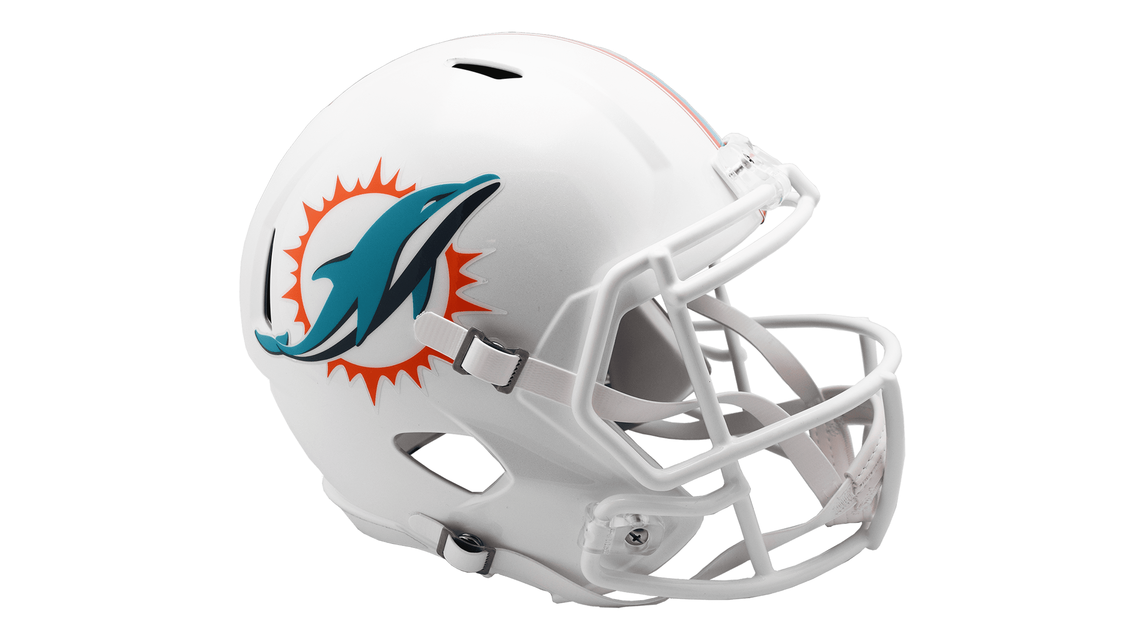
For several decades, the designs were pretty much the same – mostly white surfaces with turquoise and later orange stripes drawn across the headwear. Obviously, the emblems on the sides changed, and they also experimented with the coloring of face protection. Until the 2010s, it was turquoise, and then white afterwards.
Uniform History
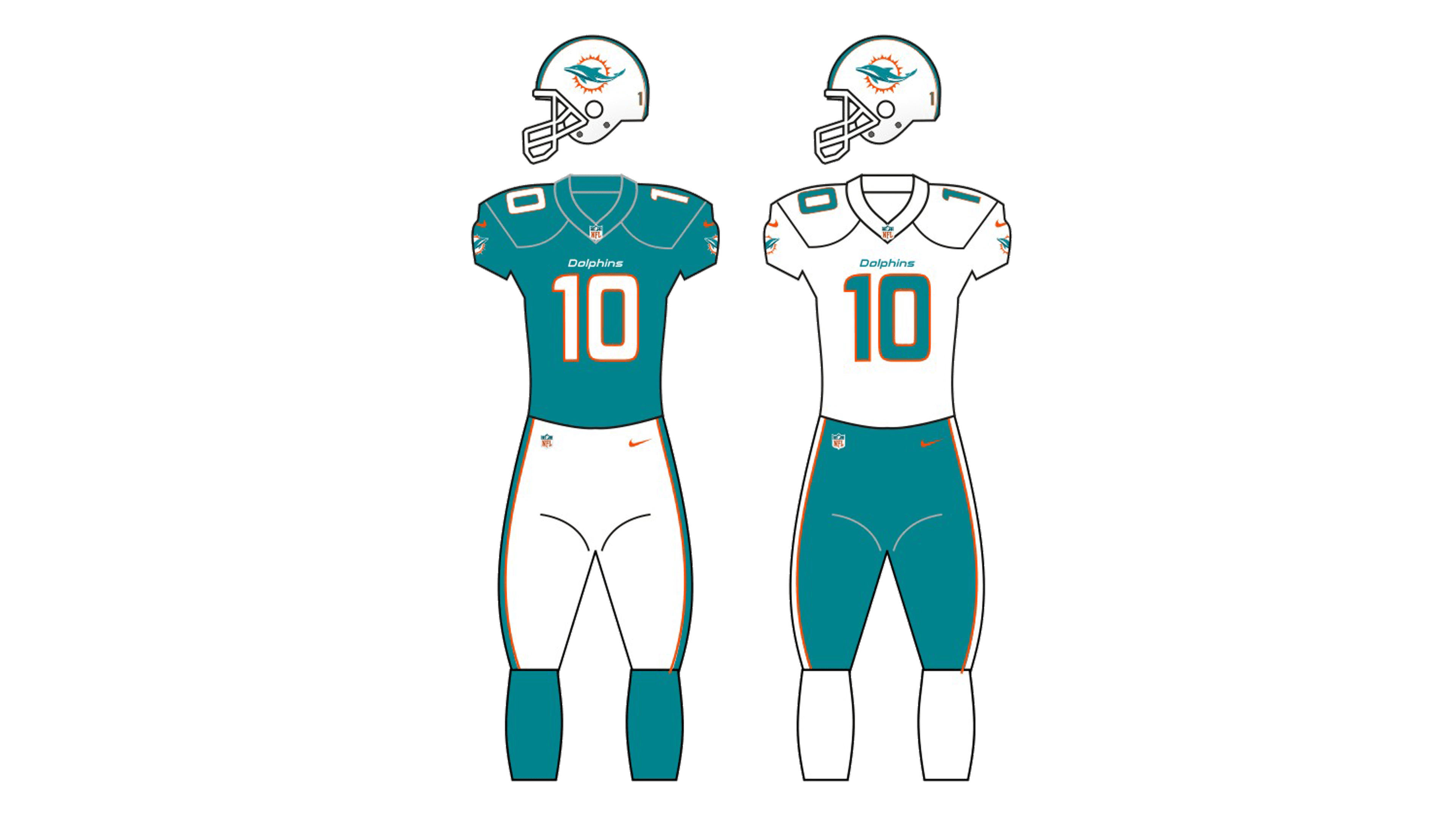
The clothing designs were primarily turquoise and white since the beginning. The most popular combinations included turquoise jerseys and white pants, and vice versa. These two alternated on the regular basis, while also co-existing with the alternative orange designs.
Miami Dolphins Colors
AQUA
PANTONE: PMS 321 C
HEX COLOR: #008E97
RGB: (0, 142, 151)
CMYK: (100, 21, 42, 2)
ORANGE
PANTONE: PMS 1655 C
HEX COLOR: #FC4C02;
RGB: (252, 76, 2)
CMYK: (0, 73, 98, 0)
BLUE
PANTONE: PMS 7701 C
HEX COLOR: #005778
RGB: (0, 87, 120)
CMYK: (100, 61, 35, 15)